Which layout works best on the web?

The main goal of communication is to capture the attention of the viewer, reader or listener.
Since communication has gone beyond television and newspapers to the web, scientists have begun to study user interactions with page layouts and website functions.
In this article we explore the characteristics of grid layouts and compare them to list layouts , to understand which ones work better on the web.
But first let's take a step back and talk about neuroscience.
The contribution of neuroscience to digital marketing
When we speak of neuroscience, we mistakenly think that these are recent studies, in reality this is not the case: in the 5th century BC Alcmaeon of Crotone, a physician and philosopher of Magna Graecia, discovered the existence of optic nerves and began to hypothesize that thoughts resided in the brain.
However, it is with modern technologies that we have been able to study the brain's responses to external stimuli more precisely, including visual stimuli. Today we know that our decisions are based above all on emotions and that we are not aware of how much the latter are influenced by the variables that characterize the context.
Thus, if in the past a good part of communication was based on the idea that the message should speak to the rational part of people in order to be able to convince them to take an action or to buy a product, today almost all communication tries to speak to our part. more emotional , and to know those variables that influence mental mechanisms.
Thus, in recent years, we have come to talk about neuromarketing, with reference to the set of marketing techniques that use the knowledge acquired from neuroscience and apply it to communication aimed at users/customers.
Neuromarketing and the organization of information
Some of the very important variables we have mentioned are related to the way information is presented : colors, shapes, brightness, movement, etc. they can help attract attention and set in motion positive or negative feelings in front of a message.
This not only with reference to advertising messages but also to internet pages that provide information. For example, let's think about how many times we have left a site because the information contained within it was difficult to read , presented in a confused way or with colors that did not facilitate reading: using neuromarketing techniques is useful for selling a product or service , but also to facilitate user navigation and to design clear and user-friendly interfaces to limit the cognitive effort of the reader.

List layout and grid layout for organizing content
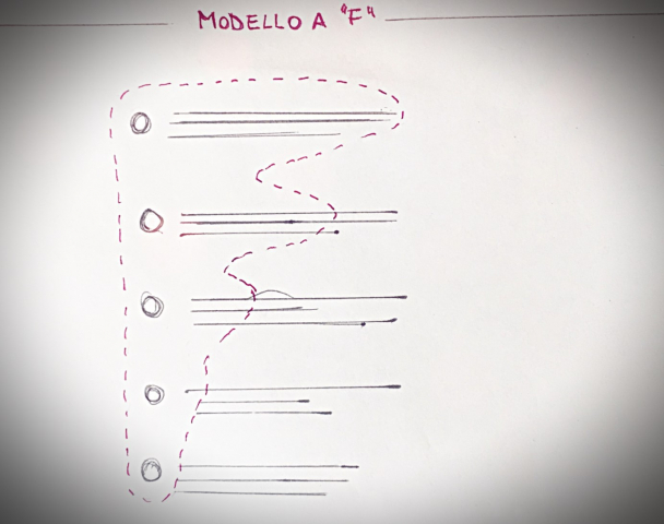
Why is the list model referred to as the “F model”?
With eye-tracking and scan path (two techniques that trace the eye movements of a subject in front of a visual stimulus, even if they report different information) scientists have understood that our brain, faced with a series of information arranged in the form of a list, follows the so-called "F model" , i.e. an eye path that begins at the top left, continues horizontally along the lines of text and scales downwards, according to the sense of reading widespread in the Western culture.
This is, for example, the typical visual path that we implement in front of a search engine results page (SERP): it is interesting to note that within ten years, from about 2004 to 2015, on average we limit ourselves to the “visual scan” of the first part of the “F”, i.e. of its vertical shaft. This change occurred because we dwell less and less on information: we are increasingly accustomed to the scrolling mode of social networks , and less and less oriented towards the complete reading of the lines that a book, for example, requires.
What about a grid layout instead?
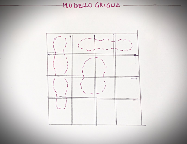
The great diffusion of applications for mobile phones and tablets has led to a greater use of the grid layout, which allows the user to have all the information just a click away or, better still, a touch away .
Although our sense of reading often leads us to start from the upper left box, in the grid layout the eye can be led to follow the rows and columns as guides for reading , in a less definable path priori, and which is influenced by other factors such as the size and colors of the elements on the page.
When to use a grid layout or a list layout?
When designing web pages, it is necessary to take into account the objectives of the project, the actions we want users to perform on our site and the most functional way of organizing content.
Both layouts have different characteristics, to be evaluated on the basis of our needs.
Pros and cons of the list layout
Advantages
- It is very suitable for those pages that rely mostly on textual information ;
- Facilitates "F" reading , which is people's natural reading method;
- It proposes a hierarchy of information;
Disadvantages
- It's not very eye-catching because it features more text than images;
- It has the disadvantage that the user's attention is concentrated on the first few lines , decreasing as it proceeds downwards.
Pros and cons of the grid layout
Advantages
- It lends itself well to pages that rely on images ;
- The user's attention is distributed more uniformly on the elements present;
- It's catchy , especially when used with little text;
Disadvantages
- It presents less information on the individual objects present, and therefore the user could be forced to navigate to other pages;
- It may require other visual devices to make some elements stand out over others.
The choice of the best layout for the design of our web pages must be based on a user-centered and user-friendly design , in order to provide the user with a positive browsing experience and which leads him to find the product or information he is looking for. is looking for. To achieve this goal, neuromarketing techniques help us understand the behavior of our brain, in order to make design more and more effective and responsive to the needs of our users.
When you subscribe to the blog, we will send you an e-mail when there are new updates on the site so you wouldn't miss them.
By accepting you will be accessing a service provided by a third-party external to https://www.insightadv.it/




































Comments