
Character matching: basic theory and examples
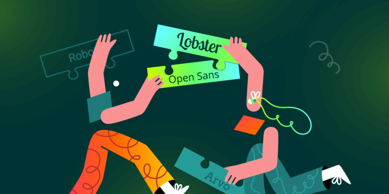
Beyond the usual ready-made examples, let's discover the principle on which a successful typeface matching for our book, magazine or commercial publication is based.
The task is not easy, the distances to be covered are long and the unexpected in the path different but we will see how, relying on the solid principles of graphic composition, we will come out of it.
We will start from some observations, definitions and principles among the most consolidated in the professional practice of typesetting that will prepare us for the more practical task of font selection that we will begin in this article and continue in the next.
No shortcuts made of beautiful and ready combinations (although you will find several by way of example) but a bit of culture that will allow us to walk on our own legs.
But first of all, why use different fonts and different font families in the same writing?
Two important definitions
Forgive me this parenthesis. Just two very simple and simplified definitions before continuing:
- Character: The single graphical representation of a letter, such as Helvetica Bold. Synonym: font although this term refers more precisely to the digital font file.
- Character family: Various graphic representations of related letters, for example: Helvetica regular, Helvetica bold, Helvetica italic. Synonym: font (see above).
The goals of a good font match
So why force ourselves to use different characters and even font families in the same script?
Without pretending to create a very precise and complete list, what we try to achieve in typographic elaboration (the care of characters, spacing, spaces, legibility in general) of a text is basically this:
Harmony
The sense of order and beauty, the way in which the various parts of the text are together, the search for coherence, beauty, aesthetics.
Originality
Being able to attract, to arouse interest, to produce a layout capable of standing out from the crowd. Give personality.
Contrasts
Highlight or give special meaning to certain parts of speech. Distinguish main content from secondary, titles from texts, create hierarchy.
Image
Adapt to the image of the company/editorial brand or the graphic and typographic elements characteristic of a series.
The ultimate goal is to facilitate reading, comprehension in the broadest sense of the term, communication.
Character matching, basic considerations
Let's get to the point. Why do certain combinations "work" and others don't? Is there a common thread, a principle that regulates mystery? Yes, and you're about to find out.
I found many items with combinations already beautiful and ready to put in a pan to heat. Useful, of course, but at the same time they represent an impediment.
A double-edged sword, like all pre-packaged solutions: an aid and a blinker at the same time. True gourmet cuisine requires a deeper understanding. Let's try it then!
When do characters fit together?
In summary, we could say that typefaces go well together when they show the right balance of contrasting elements and similarities.
Usually, the smaller the similarity of the characters used, the greater the contrast between the two, for example between a title and the main body. So to reiterate the decision.
Uncertainties are always penalizing. For this reason, using different characters that resemble each other in the same publication does not work well contrary to what could be deduced.
A graphic design teacher told me something like this many years ago: "differences seem like mistakes when they are light, when they are clear they communicate a message".
The titles actually express the maximum creative potential of the typographic project. Sometimes an eyesore is useful! And we could say that "the greater the ability to manage this contrast, the greater the creative power".
I don't blame you if you think it's easy to say, "they have to be different and similar at the right point." But when do you reach the "right point"?
There is no warning ringing but we could approach the concept by identifying precise elements of the typeface.
The elements of a typeface
Therefore, characters without any common element or characters without any contrast, do not communicate. However... There is a though. What is meant by "elements of a typeface"? In truth, I have already told you about it in this article, but a brief review never hurts.
Accustomed as we are to scroll through different characters every day they seem to us very simple and obvious elements. That is not the case at all. The design of a font is quite complex.
We could then divide a character into fundamental parts to refer to when we talk about similarities and diversity. By limiting the analysis to these elements we could judge ourselves when two different characters are well or not together.
In the image below we find the fundamental elements in a character with thanks and in one without thanks.
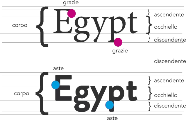
They are only the essential ones sufficient at this stage to answer the question: "is this character similar enough and different enough to accompany the other?".
There is a very functional way, not the only one, to answer this question and it is this: if Body, Graces, Rods, Ascendants, Descendants, Eyelets have similar dimensions in the two characters then, most likely, their relationship will work.
The contrast will make sense, the two characters will seem to complement each other. It is not complex at the end of the day. It's the first method you could quickly learn to match characters.
The main concept of reference is always the search for "a fair balance of contrasts and similarities", of "complementarity" to say it is basically a synthesis of the principles of graphic composition applied to typographic composition.
A good match could be given by two characters of two different families, one with and one without serifs but having similar thicknesses of the rods, similar proportions of ascendants with eyelets. Similar not identical. No need to take rulers and typometers.
In this case the similar proportions give rhythm (coherence/repetition) to the pair of characters. The differences (serif and sans-serif, bold and regular) add contrast. Repetition and Contrast: principles of graphic composition.
Are we not convinced? I had fun creating a few combinations according to this single principle.
Pairings that "work"
As already indicated, a good match includes the right similarities and the right differences (contrasts). Contrast and Rhythm are both –equally– important.
In the above examples the contrast is sharp and is given by the combination serif / sans-serif (thanks and without serifs) and bold / normal as it can be in a title / body of the text.
The contrast could also be given by the size as it happens in fact in the titles.
An insufficient contrast does not communicate: it does not "say anything" it is not "neither meat nor fish". It does not create a "polar" attraction: the right contrast of the character of the title makes the reading "bounce" on the body of the text and vice versa.
We reiterate: a good match, at least between titles and body of the text, seeks, first of all, a contrast that creates completeness.
With this in mind, I've created examples that put together pairs of characters that look very different.
Examples of character matching
Here's the first one. Very "delicate", characterized by two characters with very long temples in relation to the eyelet:

The second, just to reiterate that it is not necessary to work with different families:

And again, a combination that combines a character of Renaissance origin but still among the most used (Garamond), with a much more modern one:

One last truly "super" and modern combination:

The theory seems to work: I paired characters by choosing pairs with similar proportions of ascendants and eyelet.
I kept the same body so as not to introduce a variable that could influence judgment. But we are not satisfied, we make a counter-test.
Examples of pairings that "don't work"
I have created couplings that -not- respect the same proportions of the fundamental elements of the character mentioned above.
The contrast between titles and body "saves" in part these examples and I wanted to keep it so as not to introduce too many variables. Sometimes the combinations are not bad but something is wrong ...
In this example, a long-rod and round eyelet (title) font combined with a short, narrow rod font:

Notice how despite having the same body, the title appears much smaller. Perhaps it could be remedied by enlarging the body of the title but other disproportions would be even more highlighted.
In the next example, title with round eyelet, body with narrow eyelet:

And just to emphasize the fact that the issue is not "avoid excessive contrast" but rather "look for the right contrasts", here is a decent but poor contrast pairing (despite the bold title). Two different characters but both without serifs:

After this quick rundown what can I say? You've probably seen worse. Me too, but keep in mind that here we are trying to explore levels of absolute professionalism and precision.
For this reason, I deliberately did not want to introduce examples such as "Brush script + Helvetica". Please do the exercise yourself!
I also add that certainly there are books with a more than pleasant layout even if with imperfect combinations and maybe the "taste" has its influence. But here, I repeat, we are trying to reach the ideal scene.
Conclusions
Well, we are at the end of this first article on font matching, another one should follow and probably two more. We have learned that an easy and safe way to predict whether two characters will work well together is to evaluate the characteristics of the elements that compose them.
There is still work to be done above all because the combination of a typeface must be defined in the field (the book or magazine) to pass the final test, the test of 9.
Fonts come to life with typography: they are like clothes: when they are hung they can be liked but only when you wear them is it really possible to appreciate them – Gerard Unger, Type designer, from his book Theory of Type Design.
We will see, in particular, how character combinations behave within complex publications.
We will look at different needs, we will see how to make two and even three families of different characters work together in the same publication. Nothing is impossible.
And one last thing before saying goodbye: remember that principles, rules, customs, I like to remember often, are elements of lower rank than creativity. What does that mean?
It means that once you learn – well – you are ready to get rid of them and create your own rules. It could mean that our aesthetic sense improves to the point of developing its rationality.
It always happens like this: once you have decoded a field you find yourself a bit limited.
But before taking the highway at 130 mph with trucks next to it, it is right to do some practice in the most familiar streets of the country.
When you subscribe to the blog, we will send you an e-mail when there are new updates on the site so you wouldn't miss them.
About the author
By accepting you will be accessing a service provided by a third-party external to https://www.insightadv.it/


Comments