
Landscape composition: negative space
So far in this series of articles I've talked about compositional element weights and how to use their properties to balance your composition . But there is much more to maintaining an attractive and balanced image, this time we will talk about another very important compositional element: the empty space, around the elements, or as it is better known: the negative space .
Just like size, prominence, and level of detail, the negative space around a compositional mass is intimately connected to its location and how it interacts with other masses in an image. Negative space accentuates one element and separates it from others, helping to define how drawn the viewer's eye is to a specific location in an image.
The space around an element doesn't just affect that element, it also affects how much space we need around other elements, in order not to lose compositional balance. But contrary to what determines weight, space has only one property: how much of it there is or isn't.
Determine how much space is needed
Too little space and too much space are both detrimental to a composition's appeal, so we need to understand how an element's properties determine how much space it needs around it. This could be summarized very easily: the heavier the compositional weight of an element, the more space it needs between itself and the other elements. You might look at it as if a heavy element has influence beyond its own boundaries and prohibits other information from competing for the viewer's attention in that perimeter.
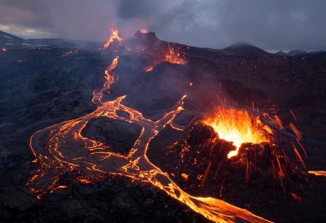
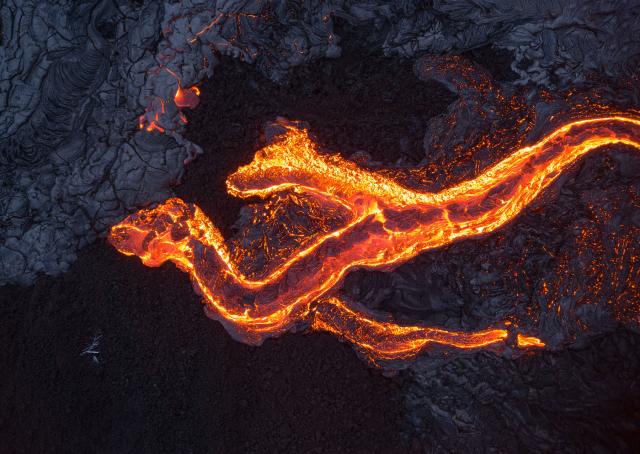 A two-headed lava dragon is a large, prominent, and detailed mass, and therefore needs a lot of space around it. Less space than this would make the framing too narrow and make the image look less attractive. (DJI Phantom 4 Pro, 1/13 sec, F8, ISO 400)
Below is an example from Iceland:
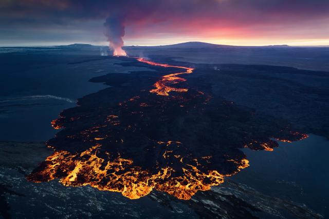 The foreground element here is very large, but it's not very prominent - most of it is as bright as its surroundings, with only the outer lava being brighter. The photographer therefore chose to avoid adding too much negative around it and to have it relatively close to the edges of the frame - do you agree with the photographer's choice? (Canon 5D2, Tamron 24-70mm F2.8, 1/200 sec, F4, ISO1600)
In the bottom image, the two background masses have similar compositional weights, with the left mass being slightly more detailed and more prominent, so the amount of space around it is a bit larger than that of the right mass. The mass in the foreground, however, is much larger and heavier than both, so in retrospect, perhaps the photographer should have given it a little more space. One could argue, however, that the gray portion to the left of the foreground also feels and behaves like negative space.

Use negative space to improve balance
Negative space can be controlled in ways that maintain and enhance compositional balance in a landscape image. My personal feeling is that maintaining a similar level of distance between masses of similar weight, and from the edges of some masses to the edges of an image, makes for a more pleasing composition. Let's look at some examples:
 A golden sunset in Lake Myvatn, Iceland (Sony A7R, Tamron 24-70mm F2.8, 8 sec, F16, ISO 50)
Looking at the negative space between the two main masses, a symmetry emerges: the distance from the right side of the tree to the right edge of the frame is similar to the distance from the left side of the rock to the left edge of the frame. Also, the distances from the tops of the masses to the top of the frame and from the bottom to the bottom of the frame are similar, but opposite.
 The similarity in space between the masses and between the masses and the boundaries of the image contributes to the sense of balance. It's nice when the distances are opposite symmetrical, like here.
Another example:
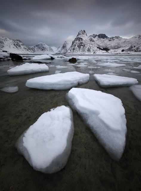
The ice chunks are very similar to each other, so the amount of negative space between them should be similar. The largest and most prominent of them, the ones at the bottom, need more space around them. But here too the distances between the two masses in the foreground and their respective edges of the image are similar, and are also similar to the distance of the main mass of the background from the upper edge of the frame. Again: This is definitely not an exact science, but it feels right.
 Arrows of the same color have the same length. Notice how the amounts of negative space add another dimension of balance.
Another example of a mountain:
 Can you spot some distances of similar length here? Notice how the reflection of the mountain doesn't require as much negative space as the mountain itself - why? (Sony A7R, Tamron 24-70mm F2.8, 30sec, F11, ISO100)
Dead space
Negative space isn't all about fun and games: it also has an evil cousin: dead space , a lack of content right where the eye wants to see something, which is highly problematic. Remember this image from the previous article, where I mentioned how much I dislike the top left dead space:
Dead space often occurs when negative spaces are out of balance. If the photographer determines a certain amount of negative space around an element of a given compositional weight, it can cause a serious problem if other masses of heavier weight get less negative space around them, or the other way around: if masses of lighter weight get more negative space around them. This type of problem can often cause a feeling of instability in the viewer's eye. Let's look at an example.
 A nice cloud inversion with the mountains peeking out - nice! But the composition isn't perfectly balanced, due to the inconsistent use of negative space. Canon 5D3, Canon 70-300mm F4-5.6, 1/200 sec, F8, ISO 200
Looking at the subjects in the background In the image above, we can see an inconsistency: the subject in the heaviest background, the mountain on the left, receives very little negative space around him, while those barely visible on the right receive a lot of space. This imbalance causes the space on the right to become dead space and the image on the left to feel heavy and taut.
The existence of dead space can also be seen as a large section of an image that doesn't have as much information as the rest of the image. It's a different way of looking at the same thing, but it's easier for some readers to understand. The image below is a good example of this:
 The lower left of this image is almost completely devoid of information, while the rest is rich in information. This causes the lower left section to become dead space and damage the composition.
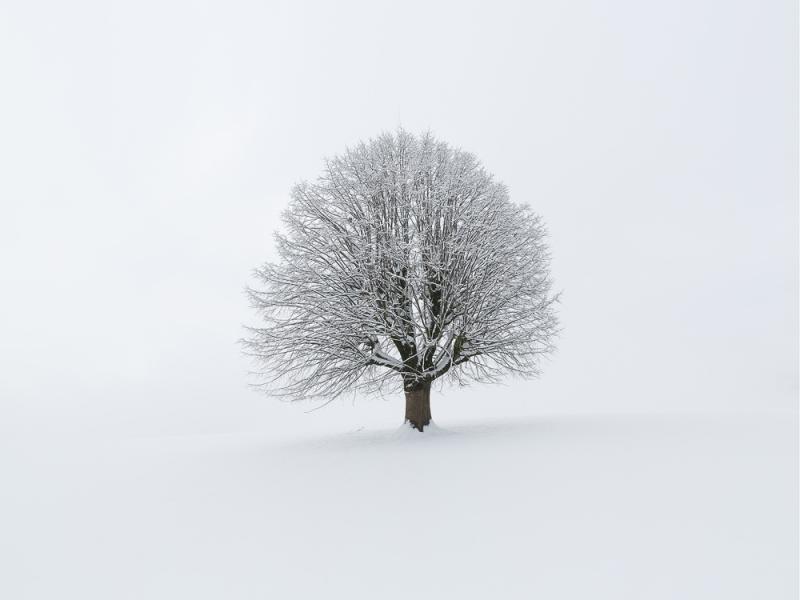
Large amounts of negative space aren't always bad. If areas of negative space in an image are balanced in the same way as masses, there is no reason an image would not work. Do you remember the shot of the lonely tree with which I opened this article? I think it works very well, even if most of the image is white, negative space. Below are a collection of other minimally composed photographs with ample amounts of negative space. For each image, I've provided a description of why I think these photographs work compositionally.
 Both the eclipse and its reflection have a lot of negative space around them, but this negative space is both necessary (because the masses are so prominent and therefore very heavy) and balanced (from the negative space on the right). (DJI Mavic II Pro, 1/10 sec, F2.8, ISO 100)
 The negative space below helps enhance the ptarmigan trails in the foreground, and because it's balanced with the space above, it doesn't cause any unwanted tension. (Canon 5D3, Canon 16-35mm F4L IS, F14, 1/30 sec, ISO800)
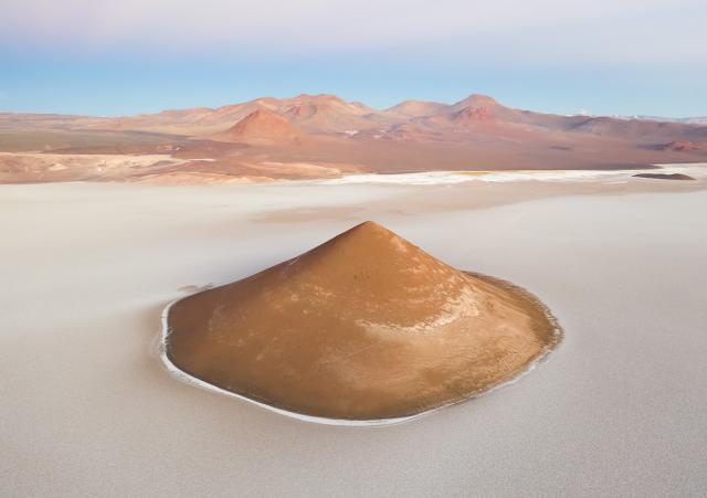 The main subject of this image, Arita Cone, has tons of negative space around her. But there's no dead space here, just negative space that simply makes the image feel airier. The amount of negative space at the top counterbalances the negative space at the bottom. (DJI Mavic II Pro, 1/15 sec, F3.2, ISO 400)
Another example:
 A bird's eye view of Ha Long Bay, Vietnam. Can you implement what we learned in the last 3 articles to analyze this composition? (DJI Mavic II Pro, 1/40 sec, F8, ISO100, Vertical Panorama)
I think part of the appeal of this composition comes from the fact that not only the masses, but also the negative spaces are balanced in the image above. In fact, there are many similar distances between different elements and between elements and image edges.

Some of the distance comparisons might seem a bit stilted. In any case, ignore them: needless to say, the photographer was not accounting for all distances while flying his drone, who knows maybe even half asleep, early in the morning. However, you can't ignore the fact that there is a balance of negative space and I hope you agree that it contributes to a better sense of compositional balance in the image as a whole.
To finish this installment, let's take a look at one last image.
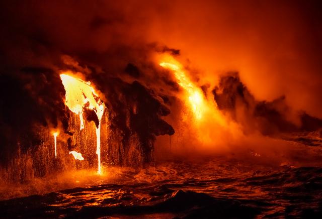 Lava pouring into the Pacifiic Ocean at the Kamokuna Ocean Inlet, Island of Hawaii (Canon 5D4, Canon 70-300mm F4-5.6, 1/250 sec, F5, ISO6400)
Given what we've seen so far, why did the photographer choose to include so much more negative space on the right? The two main masses have similar compositional weight, so what's going on? This shows us that the negative space discussion isn't quite over. We will continue to talk about it in my next article.
When you subscribe to the blog, we will send you an e-mail when there are new updates on the site so you wouldn't miss them.
About the author
By accepting you will be accessing a service provided by a third-party external to https://www.insightadv.it/


Comments