
How to choose a color palette for your project

An important aspect for any project, whether it's a brochure, a poster or a website, is the choice of color . Choosing a color is a complicated process that requires careful design analysis, but choosing an entire color palette can be even more complex. Of course there are many other aspects that need to be taken into consideration, but color as well as being one of those that is closest to my heart is also one of the fundamentals because it allows you to leverage the emotional aspect.
In this article, I have therefore included a series of personally tested tips to ensure that the choice of colors for a project is faster and more effective. Before starting, however, remember: each type of project has different technical needs and your design choices must be consequential. For example, choosing colors for a poster is different from choosing colors for a logo .
Why is the definition of the color palette important?
It is fundamental, because it allows us to define the chromatic aspect of the project, and it also allows, through an adequate study, to be able to give the right importance to the various elements.
It is advisable to avoid using an excessive number of colors , in order not to give the idea of disorder and to prevent the message from being misunderstood.
Obviously, as we have said, each project is different and has very specific characteristics for which all stylistic choices must be targeted for each solution.
Choosing a color palette is a process that requires analysis and study , in the design phase I usually start by identifying the main color, which can be given by the logo, an image or other references and once determined I then proceed by defining the secondary colors that will have to be associated with the principal.
Since analysis and choice aren't always easy decisions, here are some tips to make your life easier:
1. Use the standard combinations
The number one advice is the usual: if you don't know what or how to do, do things simple, start from the ABC. When it comes to choosing colors in design, the ABCs are standard combinations, the basis of color theory.
Very briefly, what does color theory say?
Virtually every color is given by hue, ie the pure color, brightness, ie the amount of white or black in a color, and saturation, ie the intensity of a color. That said, there are three categories of colors: neutral colors (grayscale from white to black), primary colors (red, yellow, blue), and secondary colors that are generated by mixing primary colors.
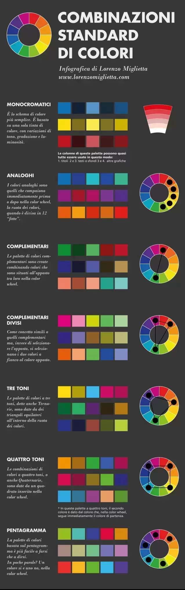
OK, knowing that, there are some standard color schemes that allow, especially for beginners, to create functional color combinations. There is a simple infographic, which illustrates some of them, created by Lorenzo Miglietta.
2. Don't go overboard with the number of colors
The colors are nice, ok, and everyone likes colored things, ok. However, like all good things, one should never overdo it.
Remember that a good color palette works much better when it doesn't have too many colors. Why? Well, because each color sends a precise visual message to the observer, and using too many risks confusing the observer or not getting the desired message across correctly.
This does not mean having to become a Swiss school-style design purist of the type “ you must use only primary colors ” or “ use a maximum of three colors for each project ”. No, in everyday design and graphics, each project needs a different approach , a different way of thinking and therefore a different color palette. Which can be 2, 3, 5, etc. The important thing is to know how to moderate and not use too many.
3. Use as many colors as needed
At the same time, every project needs all the necessary colors to be expressed in its entirety. This point may seem to contradict the previous one, but it doesn't, it reinforces it
In fact, by moderating the number of colors used, you must, in any case, use all those you need! For example, if you're doing an illustration concerning, I don't know, a landscape of my beloved Naples, you won't be able to avoid inserting some colors to characterize, for example, all the facets of a street like San Gregorio Armeno.
In short, use all the necessary colors but make sure that there are not too many!
4. Take advantage of color psychology
Color psychology is something every designer should always consider in every project.
When we talk about color psychology we refer to all those theories (which have a strong impact in everyday life) according to which colors have different effects on people. For example, some shades of blue give a relaxing effect, dark green generates trust, orange stimulates creativity and so on.
There is no doubt that colors play a fundamental role within a project and this largely depends on the effects that those colors generate on the observer, on his mind.
In one of the first blog articles I wrote, I explained how to choose the right color for a logo by considering the effects each color has on the observer.
And this is true for logo design as well as for any other area of design, from the color palette chosen for a website to the palette of a poster or an infographic. So why not take advantage of color psychology? I refer you again to this other article in which I explain how colors influence us and what effect they have on us!
5. Consider your target audience
A color palette intended for a poster for a bank must obviously have different characteristics than a color palette intended for an adolescent target.
Obviously the psychology of colors comes into play, but not only! Consumer habits and preconceptions also influence a target.
Consumer habits are those that lead us, for example, to look for shampoos in supermarkets through bright colours. This is because we are used to seeing shampoo packaging as very colorful packages and we also look for them thanks to the colors that identify them.
Therefore, if you are dealing with a highly habitual target, you have two options:
- You standardize (reworking) and choose the colors that all the others choose (the competitors, in short)
- You stand out and do something completely different
People's preconceptions are instead the cultural baggage that a person has regarding a certain color. You can be influenced by culture or by your own personal experiences. For example, in Western culture pink is associated with women, black with death, and so on. And these are preconceptions to consider if you work with well-defined targets.
5 more tips for choosing a color palette
Here are another 5 slightly more advanced tips for those who hang around a lot in the world of graphics and design and for whom choosing the right color or palette is a daily routine. Ready?
6. Use photographs to create your own color palette
One of my favorite ways to create a color palette is to start from a photograph.
Speaking of which, there is a wonderful tool called Adobe Color (once called Adobe Kuler), which allows you to do this process of creating a palette super-fast and intuitively.
Adobe Color is also available on mobile and is very convenient if you want to create a color palette using your phone's camera. Again, once you've chosen your color scheme, it's easy to save it to your libraries and view it on all devices connected to the Creative Cloud. Look for it in the App Store or Google Play.
7. Create an atmosphere
Understanding the psychology of colors, taking advantage of photographs to create your own palette, are all aspects that must serve us designers to create an atmosphere in our project thanks to the colors used.
Colors in design serve to create an atmosphere, to convey a message .
The objectives of the brand you are working for must guide the choice of colors. Certain objectives must correspond to certain design choices.
8. Copy color schemes that work
“ Steal like an artist ” is a very famous book by Austin Kleon, also available in Italian with the title Ruba come un artist . This book is about how nothing is original, especially in the creative world, but everything is a simple reshuffling of what already exists. A reworking. A designer doesn't invent, he innovates!
Immature poets imitate; mature poets steal;
bad poets spoil what they take, while good ones make something better, or at least something different.
The good poet amalgamates what he steals into a complex feeling that is unique, absolutely different from what it was drawn from.
The principles of Austin Kleon's book can easily be applied to the topic we are talking about too, right? How many times have you found yourself in front of a poster, illustration or website with perfect (or almost perfect) color palettes for your project?
It happened to me, often and willingly, and I copied (in the way Austin Kleon described) palettes from other projects, then adapting some elements to the project I was working on. The trick is to copy and know how to rework, readjust!
9. Try to be "The Purple Cow"
Immediately after advising you to copy the most effective color combinations, I immediately contradict what was said, telling you that sometimes it's better to try to stand out , creating unique color combinations. In short, you have to try to be "the purple cow".
I'm not referring to the Milka chocolate cow, but simply to one of the most famous marketing books, the famous " The Purple Cow " by Seth Godin.
The principle behind book and title is precisely to stand out! If, for example, you are on a train traveling in the countryside and you keep seeing brown and white cows, at some point you will stop looking at them and ignore them, but if, suddenly, you happen to see a purple cow, wow! You certainly don't forget that one, right?
The same theory can be applied in the world of design and choice of colors.
10. Practice, play, experiment!
Design is experimenting, trying, playing with shapes, combinations and colours.
And the game, understood as experimentation, is something that incredibly increases creativity and therefore improves the creative process.
Useful resources
Before concluding this article, I leave you with a series of useful resources of various kinds that can help you delve into the topic of choosing colors and make this process more efficient.
First of all, it must be said that many of the programs used to make graphics have tools within them that facilitate the creation of color palettes. For example, the one I use most often is the Illustrator color guide which, starting from a color, generates standard color palettes for you.
There's also the Color Theme tool , present in more recent versions of InDesign , which allows you to do a similar job to Illustrator's Color Guide, creating color palettes to add to your personal library.
Online tools
I start with the best online tools available for creating or managing color palettes:
- Adobe Color – we have already talked about it, we also mention it here!
- Coolors.co – One of the most useful and complete sites for creating color palettes.
- Color Trends – a site dedicated to trends in the world of colors.
Most of the image stocks, including Shutterstock, offer the possibility to filter the image search also based on the colors.
Books
To learn more about the subject there is nothing better than using books dedicated to the world of colours. These are the best I know of. If you have others to recommend, write them in the comments! I will try to add them!
- The art of colour. Practical guide to the use of colors by Betty Edwards. It is one of the most read and most appreciated books in the sector and delves into numerous topics with a professional but clear and direct approach.
- The Art of Color by Johannes Itten , a landmark book in the history of graphics.
- Colors. How to mix them to get the tints you want , by Ian Sidaway. An excellent book dedicated, however, more to the world of art and painting.
Finally my advice
If you want to be daring, choose complementary colors to enrich the graphic elements.
You can use solid colors and shades of a complementary color, avoiding too much color contrast.
Remember that choosing the right colors is not enough to convey the correct message to the target audience: you also need to know how to combine them in the most appropriate way!
Creating an effective palette is very important for a winning final result!
When you subscribe to the blog, we will send you an e-mail when there are new updates on the site so you wouldn't miss them.
About the author
By accepting you will be accessing a service provided by a third-party external to https://www.insightadv.it/


Comments