
Helvetica, aseptic and essential, but not banal.
Whether you like it or not, it doesn't matter: Helvetica is a piece of history. The role that this font has had and still has in design has been so decisive that no, a designer cannot ignore it.
What are the characteristics of Helvetica?
Helvetica evokes the class of the 60s and the language of advertising of that period, marking all the 70s and those to come in an important way.
It has an aseptic and essential personality: in fact, its distinctive characteristics are neutrality, cleanliness, readability, versatility.
And above all, it is always open to interpretations of the context.
The typical mistake: mistaking cleanliness for banality
Surely a character can not like. Recall that Helvetica has been a much loved and used font but some internationally renowned designers such as Erik Spiekermann, Stefan Sagmeister and David Carson have accused the font of being boring, cold, impersonal and now too inflated in the field of design. And a personal opinion can be shared as long as you don't end up mistaking the specific characteristics for banality.
Characteristic of this font is its elegance, combined with a high degree of neutrality and technicality much appreciated by the graphics of the Swiss school for its essentiality, high legibility and formal resoluteness.
Because Helvetica leaves room for the rest, manages to have a strong character and at the same time gives all the necessary space to the message, without frills.
The fact that the use of this font means "insured success" for many is also its cross : we know very well that many aspects need to be studied before deciding whether or not to use a font but precisely thanks to the characteristics that make it universal , Helvetica is used too often to "rest calm", prompting many designers to skip or underestimate that fundamental choice process in every project, the one that will in fact characterize it.
Then Helvetica is accused of being slammed into every graphic design . There may be: many designers, especially at the beginning, make this mistake by putting aside the study of lettering but that doesn't mean you have to hate him: it's not his fault. He has the only flaw of being too beautiful!
But I'll stop with the personal considerations and go back to the serious features?
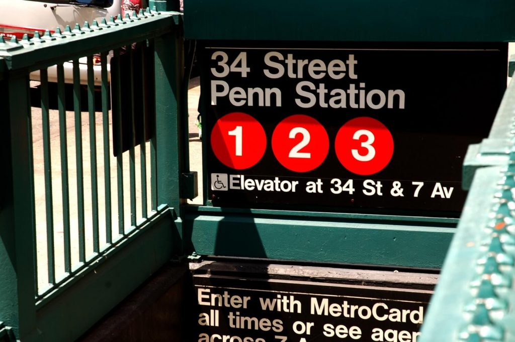
Helvetica is a dynamic font: widely used in brand design because it always develops vertically or horizontally, never diagonally. A detail: the "drop" that develops for example in the lower case "a" gives an interesting element that can be used to "break" the sumptuousness of the decisive shapes and to develop captivating shapes also through the softness of the curvature.
“The meaning must come out of the text, not the typeface»
But let's go back for a moment, an article without talking about history makes no sense to exist.
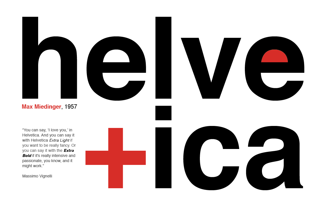
The Helvetica font was created in 1957 by Max Miedinger , a freelance employee who had been asked to think of a sans serif typeface for a new typeface line for the Swiss foundry Haas .
But the first name was not Helvetica: before becoming officially one it was called Neue Haas Grotesk.
Max Miedinger draws this new font in 1957, in one year. It seriously risked being called Neue Haas Grotesk but later, in 1960, it was renamed Helvetica (derived from Helvetia, Switzerland in Latin) to give it a twist on the international market .
The name is thought to evoke the avant-garde of Swiss Technology , a super cool phenomenon for the time: agencies and designers from all over the world saw Helvetica as the font that reflected the industrial trends of the time.
Helvetica was innovative because it understood Design as the objective communication of an idea, not as an artistic expression.
The very idea of designing a typeface like Helvetica went towards a crucial -idealized- expression of modernism .
Also in 1957, three typefaces were released, all designed in the same neo-grotesque manner: Neue Haas Grotesk by Eduard Hoffmann and Max Miedinger, Univers by Adrian Frutiger, and the Folio by Konrad F. Bauer and Walter Baum.
The explosion was immediate, those were the years of the greatest revolutions in lettering and therefore the ground was more than fertile. He was immediately chosen by the biggest advertising agencies.
In a short time Helvetica began to appear in corporate brands, signage, art prints, video clips and in countless other fields of visual communication until it reached its peak with Apple, which in 1984 included it among the characters of the Macintosh system, allowing its diffusion also in the side of digital graphics.
Given the great success, Linotype then published Helvetica Neue in 1983, with weights indicated by two digits, ab, where a goes from 2 to 9 (ultra clear to black), and b from 3 to 7 (extended to condensed)
In 1983, a total of 51 weights were produced.
URW's version of Helvetica, free with the Ghostscript font pack, is Nimbus Sans (1987).
In December 1989 Massimo Vignelli chose Helvetica as the official typeface for the entire signage of the city of New York : from the subway to the trains, from road signs to city maps, winning the challenge against the then favorite Standard (Akzidenz Grotesk) .
But let's see what the alternatives to Helvetica are
At Haas it worked differently from Nebiolo, in which Novarese signed everything. The idea comes from Hoffmann but the font itself was designed by Miedinger, who then signed it.
There are many alternatives that I "personally" prefer.
The most interesting is the FOLIO of the Bauer foundries , designed by Bauer and Baum
It has a very particular set of capital alternatives among which a very singular capital Q stands out, which I find unexpected and beautiful.
The photocomposition version of the Folio was made by Hell (later Heidelberg/Hell) and now it seems to me that they are making a nice digital version, the URW+ and it is called URW Folio .
Another alternative is PERMANENT from the Ludwig & Meyer foundries.
It is a very beautiful typeface of which, however, only the HEADLINE weight has "survived", in the sense that the whole family has not been digitized.
The headline is an extreme burden for headlines. From a design point of view, I would say that it is "inevitable": it is difficult to design a character like this today.
Permanent was very successful in Europe and above all in Italy. It was adapted to the mechanical composition (linotype) by Simoncini, who from memory also made a version for photocomposition. Then it disappeared.
I think a little 'for the fact that in the states was more fashionable than anything else. And partly because Amsterdam Continental (the company that distributed it) also had the license of Akzidentz Grotesk and applied itself more to that typeface than to the permanent.
To conclude the magical triptych… there would also be Akzidenz Grotesk and Univers.
And I'll say right away that I don't like Akzidenz much. The terminals are too inclined for my taste and I admit to all the others that I have struggled quite a bit to reduce those inclinations until they were completely or almost completely "freed" of the "design weight" of the Akzidenz. Of course, if one is looking for a more retro flavour…
In Italy, however, there is also Umberto Fenocchio's Line , limited to lead. Always a very late neo-grotesque cane.
There's definitely someone digitizing it as we speak, I don't know if they're going to release it, I don't know how it's going to come out, I don't know if it's going to be completed. We hope, because it is a very interesting character.
International brands using Helvetica
I conclude the article with a list of multinational companies and international brands that use Helvetica in their logo:
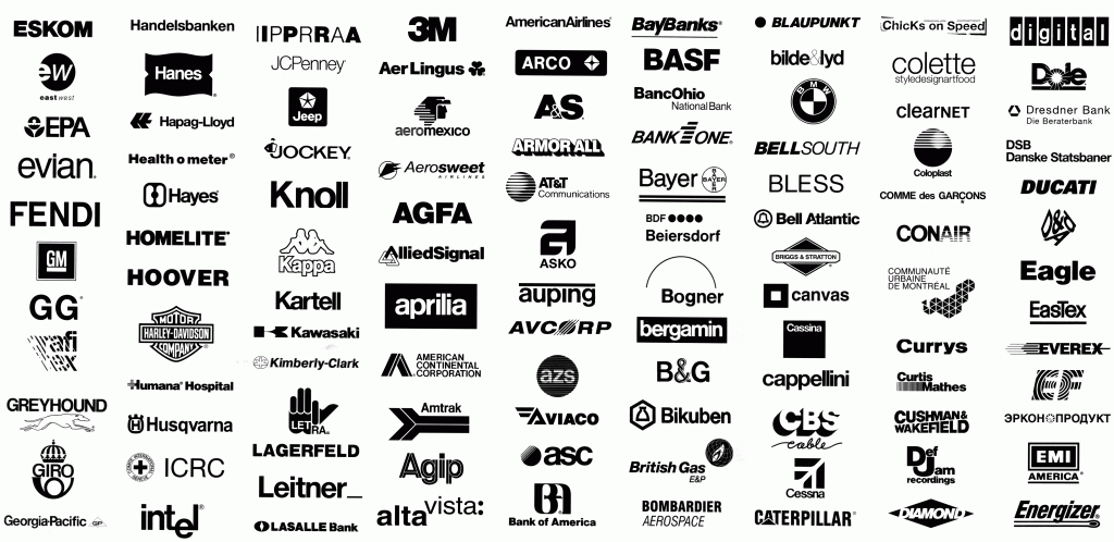
3M, 3SDM, Agfa, Agip, Alpinestars, American Airlines, Amplifon, Aprilia, Banca Popolare dell'Emilia-Romagna, Bank of America, Basf, Bayer, Beiersdorf, Beghelli, Blaupunkt, BMW, BP, Calzedonia, Cassina, Caterpillar, ConEdison , Def Jam, Energizer, Epson, Evian, Fiat (1968-2006), Fifa, Fendi, Geigy, General Motors, Greyhound Lines, Harley Davidson, Henkel, Hitachi, Hoover, Husqvarna, Intel (1968-2005), Jeep, Kappa , Kartell, Kawasaki, Knoll, LG, Lufthansa, Mattel, MetLife (1964-2005), Microsoft, Mitsubishi, Motorola, Muji, Nestlè, Olympus, OMA, Oral-B, Otis, Oviesse Industry (since 2010), Pan Am, Panasonic, Parmalat, Saab, Sanyo, Sears, Smeg, Staples, Superga, Sisley, Tamoil, Target Corporation, Tetrapak, The North Face, Thyssenkrupp, Toyota, Tupperware, Verizon, Swiss Federal Railways.
When you subscribe to the blog, we will send you an e-mail when there are new updates on the site so you wouldn't miss them.
About the author
By accepting you will be accessing a service provided by a third-party external to https://www.insightadv.it/


Comments