
Landscape composition: balance of weights
In my previous article I challenged the reader to try and see the compositional elements in a landscape photo as masses and lines. I also went through a selection of shots and guided the reader to categorize the compositional elements, try to see how they balance each other out, and begin to get a sense of how each element's properties determine where it is placed in the shot, as well as the placement of the other items.
This time I intend to bring even more order to the discussion and give you concrete ways to use the concept of masses and lines to improve your compositional skills.
When you think of a composition as attractive or balanced , it is often difficult to explain what works in the composition. For most of us, intuition is the judge of whether a composition works well or not. I suggest, however, that it is always possible to improve our vision if we can understand the origin and nature of this insight. My way of bringing order to composition is the notion of compositional weights and how to balance them.
The long-term goal of using this idea is to find a method to almost mathematically balance a composition (the "almost" is important). It always depends on the weight you give to the different elements of the shot - and those are subjective - but once you understand it, you see how and why they are balanced. Once you get a better feel for the weight method, it goes into your subconscious mind, and this is the point where you start "feeling" a composition instead of thinking about it. Something to aspire to, for sure.
Compositional weight
The most important term - and concept - that I would like to introduce in this article is that of compositional weight. Each mass in an image can be seen as having some sort of meaning, a measure of how "heavy" it is and how much it attracts the viewer's attention. This "weight" depends on many factors: size immediately comes to mind, but there are others that are less obvious: how detailed it is, how different it is in color and texture from its surroundings, and more.
The greater the weight of a compositional element, the greater the weight of the other elements necessary to counterbalance it. The immediate analogy is that of real-world scales, but in photography we need to balance scale in two dimensions, not just one. And furthermore, the scaling takes into account much more than the physical weight: it takes the compositional weight of the elements, a type of weight determined by several factors.
To make things a little clearer, it's good to look at an example, and here's one of the simplest possible ones.
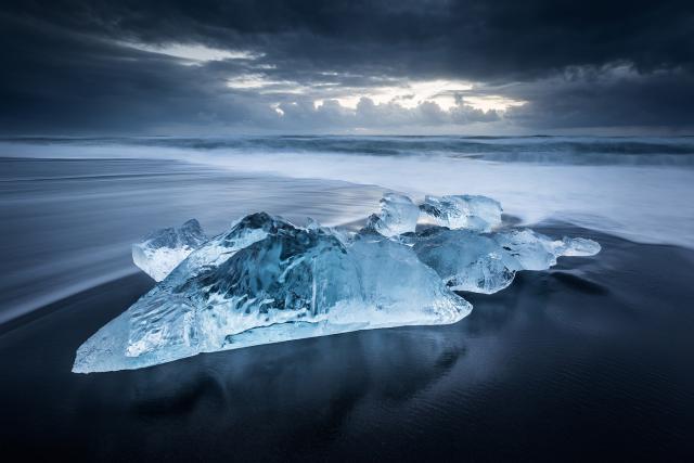 The broken ice from the Breiðamerkurjökull glacier was swept into the Atlantic Ocean by the tides and deposited back on the black beach of Breiðamerkursandur. (Canon EOS 5D Mark II, Canon 17-40mm F4, 3.2sec, F16, ISO100)
What's balanced about this composition? To answer it, we must first apply what we learned in the previous article and find the masses. Fortunately it's a simple composition, with one mass made up of the ice blocks in the foreground and the other from the illuminated part of the sky. The former is the foreground, the latter the background.
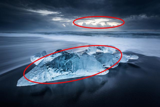
But why did I place these masses the way I did? Why is the ice off-centre to the left and the opening in the sky off-centre to the right? And why are the measures of these eccentricities such? to answer, let's look at the middle axis of the picture canvas and see how it relates to the center of each mass.
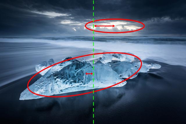
We can clearly see that the foreground subject is only slightly off-center, while the background subject is more off-center. This is intentional, but what is the reason for this choice? Before you read on, try to think (or rather "feel") for yourself: What is it about the properties of these two masses that resulted in just the right amount of off-center eccentricity?
Let's look at another example.
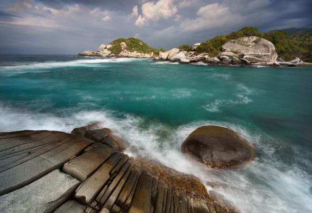 Granite rocks at Parque Tayrona, Colombia (Canon EOS 5D Mark III, Canon 17-40mm F4, 4 sec, F13, ISO 100)
This is a slightly more complex composition with more masses, but it obeys the same basic principles. What are the main masses in this composition? There are two foreground masses and two background masses, as shown below:
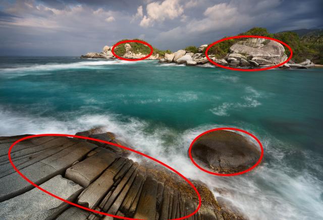
Again, let's look at the central axis and ask how these masses counterbalance each other.
 The four masses balance each other in several ways: compositional weights as discussed later, but also in the fact that there are two masses to the right and two to the left, and also two above and two below.
This time, the balancing game has more variables, but the idea is similar. To counterbalance a large, detailed, prominent mass (in other words, a compositionally heavy mass ), the masses on the other side of the axis must have sufficient "torque" (in physics, a multiplication of mass and distance from the central axis ), to maintain compositional balance and to avoid left- or right-heavy image.
My main point in this article is that a good rule of thumb for maintaining balance in a composition is to have a balance of couples around the central axis of the image. If you've ever studied physics, the idea can also be described as keeping the (compositional) center of mass near the center of the image.
I am aware that some of you may find this idea too mathematical, and I admit that my poor aptitude for calculations and formulas have taken a toll on my thought processes, but when I first started shooting I never intended to use mathematical ideas - the connection came only when I tried to explain why certain compositions work while others are unbalanced. If anything, you can think of it as a model to explain and confirm why a composition works, rather than a composition model. A small difference, perhaps, but a significant one.
I'm also not really saying that you should bring a computer when composing images as a photographer. I'm just going to suggest that you consider the weight of the compositional elements in your shot and make sure they contrast well around the central axis. Otherwise, this could throw the image off balance, which would result in a less attractive and more tense composition. Keep this idea in mind and it will help you if you have any doubts in the field.
What gives a compositional mass its weight
When I used the term compositional weight above, there was an underlying assumption that it was clear what gives weight to a mass. While in physics weight is just mass multiplied by the gravitational constant, in photography it's not quite the same thing. Let's take a deeper look at what determines weight.
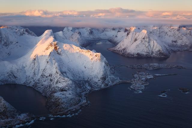
The first and most obvious factor is size. The larger a mass is in the shot, the greater its weight relative to other elements with the same properties. In the image below, the mountain on the left (Reinebringen) is clearly larger than the one on the right (Olstind). Considering the fact that both mountains have otherwise very similar properties, we can say that Reinebringen has a greater compositional weight than Olstind. Indeed, Olstind's center of mass is further away from the mean axis than Reinebringen's.
 Salt and mud structures at the edge of a salt lake in Dallol, Ethiopia. (DJI Mavic II Pro, 1/60 sec, F10, ISO100)
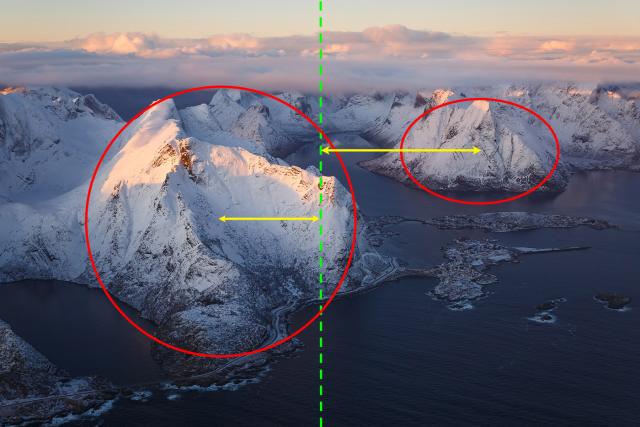 The larger mass on the left needs a smaller distance from the central axis than the smaller one on the right.
Does the same reasoning apply to the image below?
 Salt and mud structures at the edge of a salt lake in Dallol, Ethiopia. (DJI Mavic II Pro, 1/60 sec, F10, ISO100)
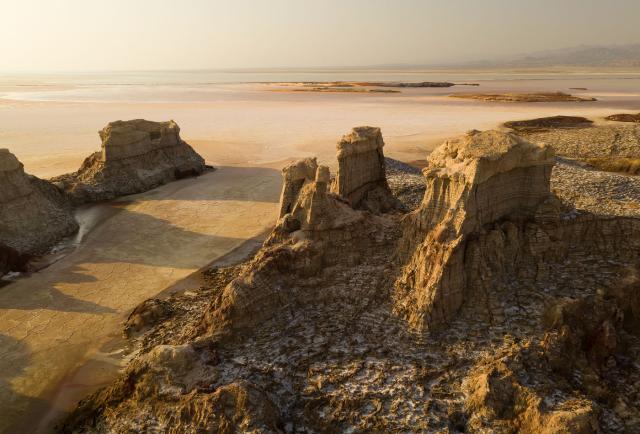
The rightmost structure is larger than the middle one, and the middle structure is larger than the leftmost one. Since they are similar in many other ways, can we infer that the rightmost structure has the most compositional weight? If we can, why is the rightmost mass the same distance from the central axis as the leftmost one? What are we missing?
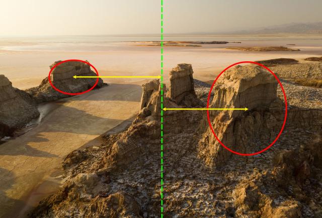 Why are the masses on the far right and far left nearly the same distance from the central axis?
We lack the awareness that other factors are at work here and need to be considered when balancing the elements. In the shot above, the leftmost element has something the rightmost element does not: prominence . By prominence of a compositional element, I mean how different it is from its surroundings, how much it stands out. While the rightmost element is very similar in texture and lighting to its surroundings, the leftmost element is anything but that. It is dark while the salt lake is light in color. Its texture is grainy while that of the lake is smooth. The color is also different. Simply put, the leftmost element stands out much more than the rightmost one. This fact gives it more compositional weight and compensates for its small size.
What about the image below:
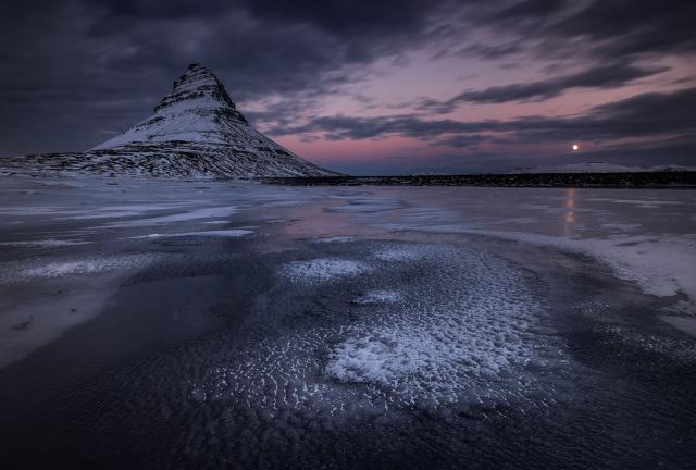
Here, if the rising moon weren't in the frame, it wouldn't be balanced. Though a tiny feature, the moon's prominence gives it a lot of compositional weight, and coupled with its distance from the central axis (and with some help from the foreground), is enough to offset the much greater mass on the left .
Let's look at another picture.
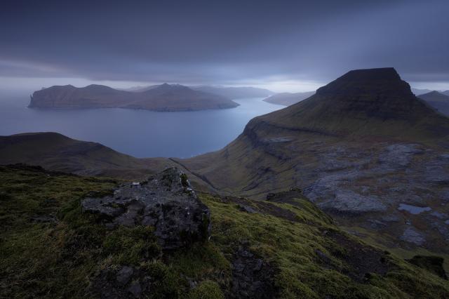 A view of vágafjørður, taken from an elevated viewpoint in Streymoy Island, Faroe Islands (Canon 5D4, Canon 16-35mm F4, 45 sec, F14, ISO 100)
The rock at the bottom isn't too big and isn't particularly prominent. How then does it counterbalance the big mountain on the right? The answer is that its level of texture and detail is greater and, together with the surrounding rough grass, its compositional weight has increased enough to make up for the lack of scale and prominence.
So, another factor in determining an element's compositional weight is its level of detail. The more detailed and textured a mass is, the greater its weight. This makes perfect sense, as more details and more textures more easily grab the viewer's attention. This easily translates into giving the considered element more importance, or in our terms - more weight.
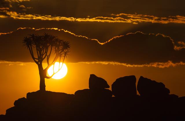 Which of the two main masses has more detail and texture? Where does your eye go here? Do you agree with the overlap between the quiver tree and the sun? If you do, what qualities in these two elements justify this overlap? Would the overlap be justified if they weren't so different in brightness? (Sony A7R, Canon 70-300mm F4-5.6, 1/8000 sec, F11, ISO 100)
An important premise is that the amounts of weight added due to prominence and levels of detail are highly subjective. It could also be argued that size considerations are subjective too, and I wouldn't disagree: after all, compositional weight is not a clear function of size, but more so than how much attention the sizable element attracts. This means that all of this balancing theory is also completely subjective . The photographer himself must determine how much importance to give to size, prominence and detail when balancing elements, but this meaning must be given in one way or another, and it is important that all these factors work in the conscious, and subsequently in the unconscious mind, during composition.
With all this information at our disposal, let's look at a few more shots and discuss how their elements are balanced.
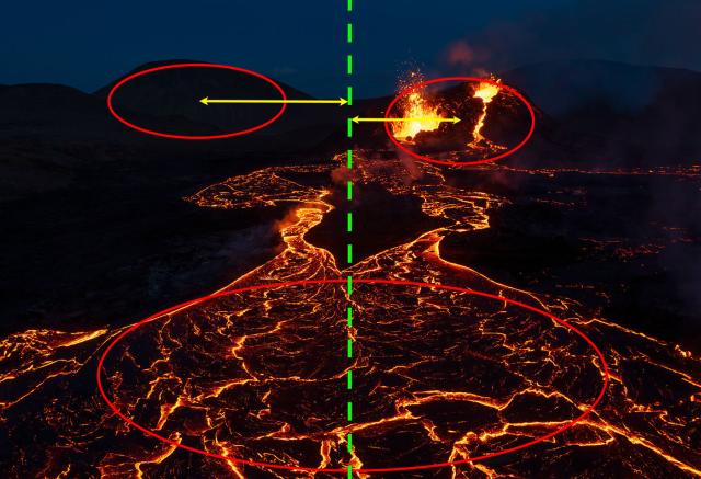
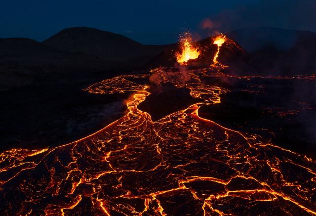 A river of lava flows from the double cone of Fagradalsfjall volcano (DJI MAvic II Pro, F4, 1/20 sec, ISO 100)
I'd say there are three main masses here: the double cone, the hill to the left, and the lava river front at the bottom of the image (there are interesting lines too but that's irrelevant for now).
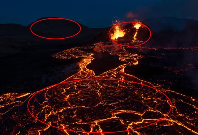
The foreground's center of mass is exactly on the central axis and therefore does not need to be counterbalanced. And the two ground masses? The right mass is smaller, but also has much more prominence and level of detail. Thus, it is heavier and must be placed closer to the central axis to counterbalance the left mass, which is less prominent.
Another volcanic example:
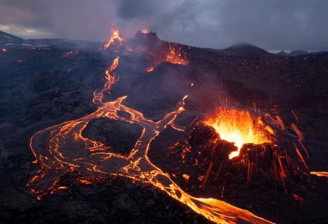
This case is much more complicated, as the masses are different and all differ in size, prominence and texture. The heaviest feature in this image is the erupting volcanic fissure at lower right. The colors and brightness of the erupting lava give it pop and detail, and its size cannot be ignored. Therefore, this element needs a lot of weight to counterbalance it. This weight is present in all elements on the left side: the lava river below and the 3 fissures above, all located to the left of the central axis. All of these fissures are also erupting, which gives prominence to their masses and gives them an advantage in attracting the viewer's eye over the normal hill at the top right.
But this image, for all the volcanic madness going on, lacks a bit of balance. The main crack in the lower right has so much weight that the only way to counter it is to have even more weight to the left than there was. The problem is that if the drone had been tilted more to the right, the river on the left would be parallel to the sides of the image, which would look inorganic and really hurt the composition (more on that in the future). Also, this would cause the upper right hill to be directly above the lower right crevice, and the upper left 3 crevices to be directly above the centroid of the lower left river bend. It's would have still been a problem.
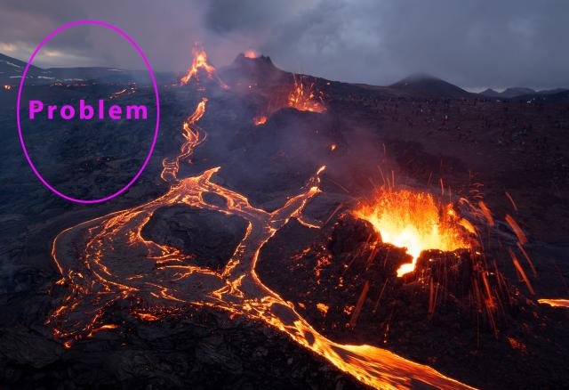
Also, the top left side of the image is a bit blank, which I don't like. The image is full of information: almost every corner has something and this fact makes the empty top left even worse. This dead space (the bad version of negative space) undermines the balance in a composition and can damage it to a great extent. This fact shows us that we have not yet finished discussing the notion of compositional balance, since even if the weights are balanced, other aspects may not be. I plan to discuss this in more depth in future articles.
When you subscribe to the blog, we will send you an e-mail when there are new updates on the site so you wouldn't miss them.
About the author
By accepting you will be accessing a service provided by a third-party external to https://www.insightadv.it/


Comments