
How to create emphasis in your design with contrast
Contrast is a very powerful graphic weapon, which allows us to highlight a certain element and emphasize it in relation to the context. We must learn to manage it in the right way, in order to avoid errors of evaluation and unbalance the entire project.
To help you find the best balance, today let's find out together how to make the most of the contrast, and which are the most used modes. Remember to always start from a careful analysis of the layout, evaluating in advance which elements you want to emphasize through contrast and which not. So you will know immediately what to focus on and you will save a lot of time.
Now, in general, it is possible to make a first division between various types of contrast: contrast of color, of dimensions and of sharpness (or luminosity).
Why use contrast?
The main goal of any advertising image is to grab the attention of the audience and stick in their mind. Images are a very relevant means of communicating effectively to a large number of people in the shortest possible time.
Being able to bring out your content among various advertising messages is not a simple undertaking. Every day consumers are surrounded by a large amount of visual elements that try to convince them to buy a product or service.
The result? Most messages are completely ignored. The contrast technique, precisely for this reason, is often a valid solution to get noticed and attract consumers.
For marketers, the principle of contrast is a strong persuasive strategy capable of prompting the public to look at things from a different point of view than they are used to seeing.
How to create contrast?
Using this technique, the graphic designers try to bring out a particular element within an image, a site or an advertisement, always trying to emphasize the elements on which they want to draw the reader's attention with the contrast.
Contrast is achieved through the use of style, emphasis and proportion, as well as color and lettering. For example, if a design were made up of circular elements, you could actually introduce more angular shapes to achieve contrast and to carve out more interest.
Although the contrast is a tool used above all to arouse surprise, it must not detach too much from the essence and style of the brand. The consumer must always be able to find consistency between the various communications of a company.
The type of contrast varies according to the communication objective. You can decide to play with different colors, images or animations. What is essential is above all to try to create visual harmony between the elements, to avoid conveying a confused message to the public.
Another way to create contrast is to cut very different images and place them next to each other. For example, combine a black and white image with a very colorful one.
Color contrast

Color contrast is one of the most used. Simply, an element is emphasized by using a color that clearly contrasts with that of all the others. In this way, the user's attention is automatically drawn to objects with the brightest color.
Colors are, in fact, very important elements in an advertising message and can influence the consumer's choice . Based on color theory, contrasting shades can be associated to make a graphic element stand out. The choice, however, must not be completely random, but must reflect the message you want to convey to the reader. In particular, one can think of the reference target and the symbolic value that colors can have based on associations.
Warm colours, in their most intense shades (red, orange, yellow), are often contrasted with cold colors such as grey, so as to immediately capture the attention of the beholder. The “colored” elements will become the focal point and will be naturally emphasized.
Another system is to relate totally opposite colors – e.g. black and white – to create a strong contrast that is impossible not to notice.
Size contrast
We then move on to size contrast, which is perhaps the simplest to achieve. What is modified this time is not the color but the size of the object.
To highlight it compared to another, it is decided to significantly enlarge it, giving it prominence and making it occupy a key position within the graphic composition.
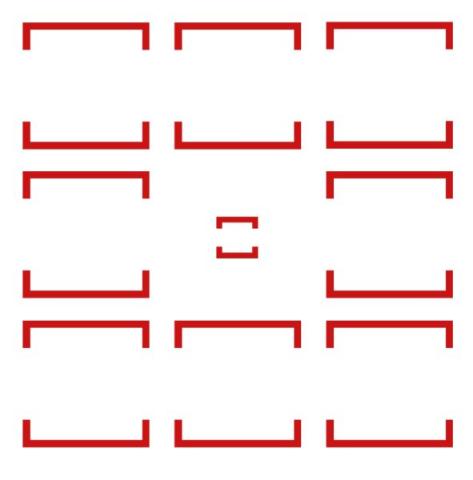
Sharpness or brightness contrast
Finally, we come to define the concept of sharpness contrast, also known as brightness contrast.
To make an image or a graphic element stand out, we can create a contrast between it and the general background. By lowering the brightness of the background, the foreground object will immediately become more evident.
Similarly, if we blur the background elements and keep the central one sharp, it is clear that we will easily be able to make it gain importance. The user's visual focus will necessarily be concentrated on the sharpest element, emphasizing it just as we wanted from the beginning.
The contrast in the texts
Font contrast in graphic design is about pairing two different fonts with a clear visual differentiation to concentrate the main information on the better known font, the most important part of the text being the title which will be the first thing the viewer will read followed by the body of the text.
It's important to know that bold or more ornate fonts can grab the viewer's attention more easily but they don't have good legibility for long pieces of text, that's why only use them for headlines or small pieces of text that you want it to land on. 'Attention. On the other hand for body text, you can use less ornate fonts as the key task for long chunks of text is to maintain good legibility and make it easy to read.
An easy way to contrast the font of a text is to use the same font for the whole design applying different weights according to the importance of the words, using bold for focal points and light or regular weights for the rest of the body text .
If the purpose of the communication is to have a title read, it is necessary to ensure that it does not get confused with the other writings: different fonts or colors can be used to distinguish the words according to the importance they cover within the message.
To focus more attention, these elements are often used in contrasting ways:
- Use bold or italics at the same time. Bold is often used to underline relevant words in the text;
- Combining very different fonts , this helps the reader to keep the attention high and not to skip important sentences;
- Increase or decrease the text size. Headings and subheadings must be larger than the paragraph;
- Insert images that give movement between one block of text and another.

The contrast in a website
Each page of a website has its own predefined purpose and message to convey. Contrast helps the page visitor orient themselves and understand what is important. In addition to guiding the reader, it makes the page more interesting and makes them want to read the entire content.
To facilitate the understanding and usability of individual web pages, it is important to accompany the user in navigation, paying close attention to these aspects:
- the button , which must be clearly recognizable, in which to insert the call to action ;
- a coherent and effective image and graphics, capable of attracting the visitor, making him stay longer on the page and prompting him to take action;
- title and subtitle are the elements that must stand out in order for the reader to understand the content of what they are about to read.
onclusions
“Make it simple, but meaningful.” – Don Draper.
With impactful images and a good play of contrasts it will be easier to create a bond with consumers and make them remember the message.
This is just one of the many techniques used in their world, but the most important thing to keep in mind when creating a project is experimentation : by following these tips, you have an excellent starting point and everything else will be the result of creativity and of the study of the product or service to be promoted. Precisely for this reason, a great artist in the sector must always keep this phrase in mind to create real impactful images: "the greater the difference, the greater the contrast".
When you subscribe to the blog, we will send you an e-mail when there are new updates on the site so you wouldn't miss them.
About the author
By accepting you will be accessing a service provided by a third-party external to https://www.insightadv.it/


Comments