
The fonts used in the most famous logos and why they were chosen
Have you ever wondered which fonts are most used in the most famous logos? Those logos that you happen to see hundreds of times, repeated on all the screens, T-shirts and sheets of paper around you.
Well then not if the only one and this article is made for you!
In fact, in this article I want to tell you about which fonts are used in some of the most famous logos .
And, above all, try to understand why those fonts, what they represent, what they mean. Because choosing a font is not a simple thing , and behind the choice of a font there is always a precise message that you want to convey.
In this article I wanted to analyze in more depth some of the most famous logos.
Ready? So let's get started!
Small clarification before starting: many famous brands use private fonts
Almost all the most famous brands, in their logo, do not use fonts available to the general public but custom and proprietary typefaces.
Very often, however, these proprietary fonts are based on already existing and already famous characters .
In this article we will try to find the “famous” font closest to that of the logos.
What font does YouTube use in its logo?
![]()
Bold and narrow, Alternate Gothic was designed by Morris Fuller Benton in 1903 for the American Type Founders Company.
It is a font with a long history, designed in the early 1900s so that it could be perfect for inserting titles in narrow columns.
It was the font used in the YouTube logo until August 2017, to be precise, when YouTube rebranded to use a new font: YouTube Sans.
This font was designed from scratch, by the Saffron branding agency, starting from the shapes and aesthetics of the Alternate Gothic used previously.
Why was this font chosen?
According to what the Saffron designers write, this current one has been chosen to "communicate its brand with only a glance" , i.e. being able to immediately communicate that it is YouTube.
And this, being a reference to the Alternate Gothic used previously, strengthens the brand's recognition.
But why was Alternate Gothic chosen?
Obviously I can't know for sure, but I think it was chosen because it's super readable.
It was designed for editorial use in the tiny size of the column titles as well as the huge size of the main titles. And then so that it was readable in every dimension. How YouTube needed it.
What font does Adidas use in its logo?
![]()
L' Avant Garde , which in French means avant-garde, is one of the most influential fonts of the 20th century. Created in 1970 by Herb Lubalin (together with Tom Carnase), it was born as the family of fonts built starting from the logotype of their magazine, which was precisely called "Avant Garde" .
![]()
The forms of the Avant Garde are very reminiscent of the natural elegance of the Art Decò of the 20s and 30s. While transmitting a vintage effect, it is still able to tell it in an always contemporary way, thanks to its flexibility and naturalness.
In reality, however, the font used in the Adidas logo is not Avant Garde.
Again, it is a proprietary font, AdiHaus. A font inspired, of course, by the Avant Garde but also by the FF Din (one of my absolute favourites).
Why was the Avant Garde/AdiHaus chosen?
The Avant Garde was chosen in 1971 by the designers who worked on the first restyling of the Adidas logo.
![]()
It was chosen both because it was a font very similar to the one originally designed in '49, and, I believe, because of its qualities: elegance, naturalness, cleanliness .
What font does Nike use in its logo?
![]()
Futura is one of the most important and influential typefaces in the history of graphics.
Designed starting in 1928 by Paul Renner, it is now considered the geometric font par excellence.
And it's also used, among multitudes of applications, for the Nike logo.
In particular, in the Bold Condensed Oblique version.
More notably, in that version but with a few major tweaks regarding skew and kerning (the space between glyphs).
![]()
Why the Future?
Because, like the "whisker" of the logo, the chosen font also conveys a message: strength (the bold version), dynamism (the inclination), stability (the geometry of the Futura).
And it conveys, together with the rest of the image, a very specific message in a clear way: Nike is a strong brand, buy Nike and you will be strong too.
What font does Instagram use in its logo?
![]()
In reality, Instagram, in its new logo of May 2016, does not use a real font.
Up until that point, the Instagram logotype was made using the Billabong font. It's a 2006 script font, which has nothing special about it , really, except… well, the fact that it's the Instagram logo font.
In 2016, however, there was the very famous rebrand of Instagram (very criticized at the beginning - not by me - but now everyone admits it was fantastic) in which the logo has also changed.
The new logo was created without using any files or fonts. It's simply designed to be the "Instagram" script.
It was designed by Mackey Saturday starting from the Billabong font , so that it was more functional and harmonious than the previous one , while maintaining some characteristic elements. As seen in this animation:

Why this font?
The answer here is simple: because Instagram was born as an application that presented itself as something dynamic, fun, energetic . That font mirrored exactly the type of message you wanted to convey.
What font does LinkedIn use in its logo?
![]()
In reality, very little is known about the brand choices of Linkedin. There are no actual designer studios or agencies that have worked on it or various brand manuals.
What is known is that the font used in the logo is definitely Avenir (at least from 2012 onwards, before it was Myriad Pro).
L'Avenir is one of many wonderful fonts designed by the amazing Adrian Frutiger, in 1988.
It is undoubtedly one of the typefaces that I appreciate the most. It is capable of combining the geometric shapes of the sans serifs of the 1920s (such as Futura) with the more natural and flexible forms of the grotesque characters of the late 19th century (such as Akzidenz Grotesk) and of the second post-war period (such as Univers, also by Adrian Frutiger).
Why this font?
Because it inspires respect, professionalism. Exactly what a working network such as Linkedin wants to convey.
Few other typographic choices would be so suitable.
What font does McDonald's use in its logo?
![]()
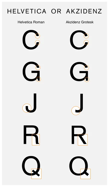
McDonald's has been using for years what is among the most important and today underrated fonts in the history of graphics: Akzidenz Grotesk .
It is an extremely legible, simple, flexible and impactful font.
It was produced by the German foundry H. Berthold AG in 1896 by an unknown maker. The current version available is the one reworked by Günter Gerhard Lange in the 1950s.
Why is it so difficult to recognize it? Well, because it's the foundation upon which some of the most widely used and well-known fonts today were built. Like Helvetica, Univers, Arial, Frutiger, all inspired by the ancestor Akzidenz.
Below you can clearly see why it is so difficult to distinguish it, for example, from Helvetica: you have to go and check the smallest details!
Why exactly this font?
First of all, in my opinion, because it is very beautiful. We cannot discuss this, then, I believe, also because it represents tradition, history. Which at the beginning McDonald's was very interested in telling.
Conclusions
In this article I wanted to talk about the font choices of some of the most famous brands in order to give you creative ideas for choosing a font for your project.
Analyzing what other designers have done before you is essential.
But even more fundamental is trying to understand the reason for certain choices . What did they want to communicate? Why that font instead of another?
Choosing a font is, in fact, a crucial aspect in the process of creating a logo but also in any other aspect of graphic design.
When you subscribe to the blog, we will send you an e-mail when there are new updates on the site so you wouldn't miss them.
About the author
By accepting you will be accessing a service provided by a third-party external to https://www.insightadv.it/


Comments