
Because it is important to know how to use line spacing well
You probably already know perfectly what line spacing is , you've certainly used this parameter often , in the documents you use for work or study.
But maybe you don't know exactly what it is and above all maybe you've never really thought about how important line spacing is . In fact, we are usually led to focus on many other variables within our graphic projects.
And yet, every time we deal with textual elements , using line spacing correctly allows you to obtain much more effective results and avoid errors that compromise the result.
So let's go and see in detail what line spacing is and above all how you can best use it for your projects.
What is line spacing
We had already mentioned it in this article Things to know about the elements of a font , but let's see in an even more precise way what line spacing is.
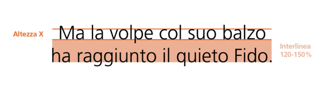
By line spacing we mean the vertical space that separates two lines of text . Even better , the space that separates the two baselines on which two successive lines rest.
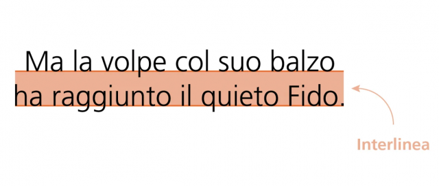
The baseline is that invisible line upon which letters without descenders rest.
This height is mostly measured in points , just like font sizes. We therefore find it indicated by a number, followed by “pt“, which means typographical points, and is the unit of measurement of fonts in the world of printing.
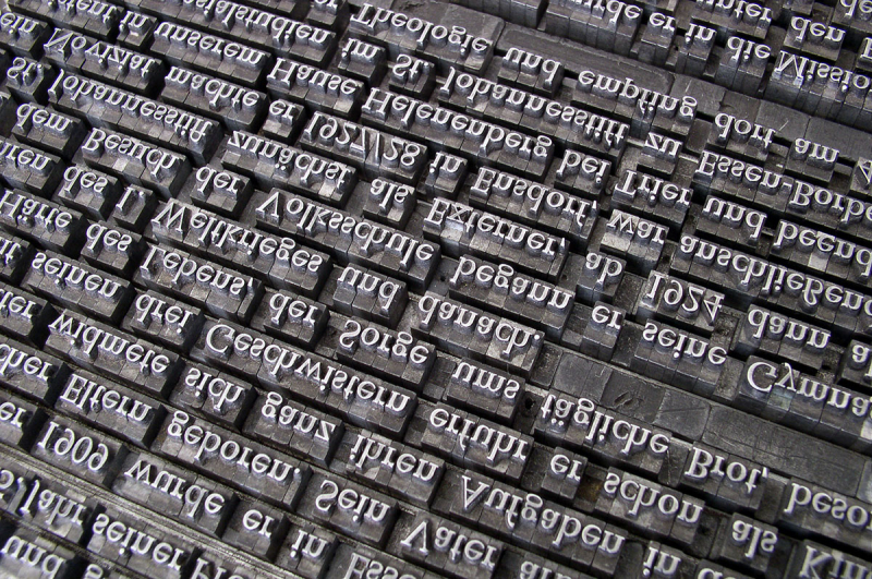
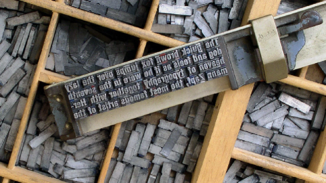
If, on the other hand, you want to search for material on the web or you find yourself dealing with interfaces that are not translated into Italian, it may be useful for you to know that "line spacing" in English is called "leading" . This word comes from "lead".
In fact, the traditional letter press was born in the context of movable type printing , to indicate the lead bar that was placed between one line of characters and another to obtain the right distance.
Why it is important to use line spacing well
It happens very often, especially to those who don't have much experience, to focus a lot on choosing the right font for their projects . But if you focus too much on choosing the font, you may not give enough importance to all those variables that can allow you to obtain different effects with the same character.
In fact, there are many parameters you can adjust, such as the horizontal spacing between characters ( kerning and tracking ) and line spacing.
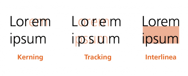
If you balance these three elements correctly, you can get the most out of the font you have chosen to use and you can also create creative games that help you make your project truly effective.
That's why I thought I'd gather some advice on how to best use line spacing.
Tips for using line spacing correctly
Don't settle for the default size
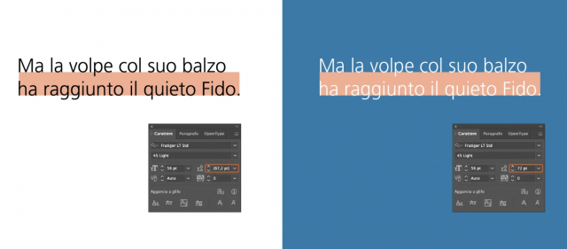
Usually, in graphics programs, as well as in video writing programs, the default line spacing is 120% . In fact, when it comes to body text, the general rule is that the distance between two lines is always greater than the height of the character . In particular, a distance of at least 1.2 – 1.5 x is recommended.
But this rule, like all standards, is really just a starting point. In reality, when you work on a graphic project, each textual element has its own specific characteristics and a different function.
So the advice is always not to settle for the pre-set size , but try to find the most correct size for that specific element.
To do this, it is best to use advanced graphics programs , such as Adobe InDesign, Illustrator or Photoshop, which give you the possibility of controlling all the variables we have talked about in a truly perfect way.
Pay attention to the color
The colors we use within our projects have a great weight in the perception of the various graphic and text elements.
Our eye reads a text more or less easily depending on the color in which it is written and the background color. For example, the effort we have to make to read black text on a white background or white text on a blue background is very different.
In the latter case the contrast is lower and therefore the legibility (or readability : the ease of reading a text) is poorer.
In situations of this type , line spacing comes to your aid : in fact, you just need to increase it a little (without exaggerating) to get the same effect you get with a higher color contrast.
Don't lose sight of the goal
Within your projects, not all text elements have the same function.
Some elements may contain messages and information that require a certain amount of time to read, others may be calls to action , still others may also have a graphic and aesthetic function , as well as communicating what is reported in the text.
In the event that the text primarily serves to convey information then your goal must be readability , which we have already talked about, therefore the readability of the text as a whole.
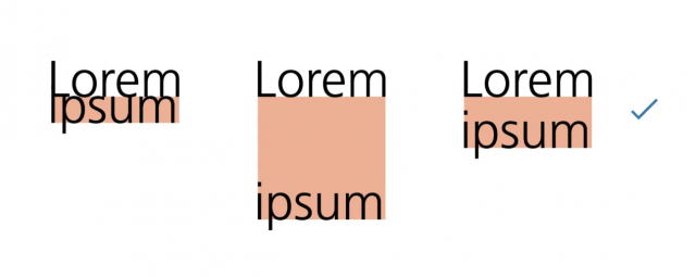
For this purpose the line spacing must be very balanced : this means neither too compressed nor too dilated. In essence, the eye must be able to scroll easily from one line to another.
With a line spacing that is too narrow, the reader risks having difficulty distinguishing the lines from each other, and easily "loses the sign". If instead the lines are too far apart it takes a lot of effort to find the next line once I finish the one I'm reading.
When my aim is to make a text readable, the line spacing should never be smaller than the height chosen for the character.
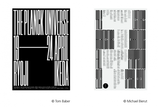
When, on the other hand, our textual element also has, or above all, a graphic or aesthetic value, things get complicated.
In these situations, in fact , line spacing can take on an expressive value . An example: by minimizing the line spacing we obtain a merger of the letters of the line above and the line below. This creates new forms, which can be very effective within our project.
Evaluate the characteristics of the font
Different fonts may require a different line spacing size . This is because each font has different proportions between the rods (ascending or descending) and the so-called eye of the character , in English X-height. With this definition we indicate the height of the letters that are not capitalized and do not have ascending or descending shafts such as x, a, e, etc.
If the font eye is very high, we will have the impression that the font takes up much more space vertically. For this reason, when we use a font with a particularly high character eye , in order to be readable, you will have to use a wider line spacing .
If you are looking for a very precise result, you could also adjust the line spacing line by line . Certainly this method makes more sense when you are dealing with very short texts with a great visual impact within your project.
Suggest text function
Through line spacing you are able to work on how compact, or light and spaced, a text element is. This means that each part of the text can have a different "weight" depending on the leading size you choose for each part.
In practice: titles and calls to action have a different function than the body text. In fact, while the former serve to attract attention and provide general information in a very short time, the body of the text contains information that we want to be read in full and with maximum ease.
This also impacts line spacing. For titles and calls to action, the general advice is to maintain a rather narrow spacing . In this way you don't "disperse" the impact of that piece of text that must capture the reader's attention.
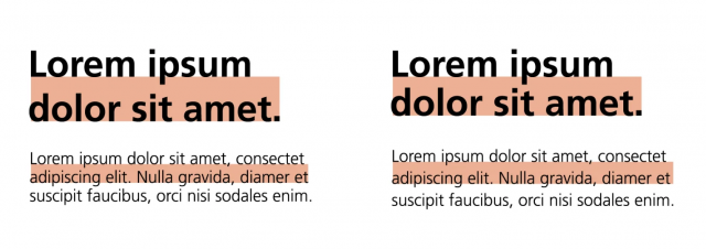
On the contrary, the body of the text should have a wider line spacing , which allows the eye to scroll easily and pleasantly. Not only that: the line spacing should increase a little as the width of the block housing the body text increases.
In fact, if the lines are very long they are more difficult to read; increasing the line spacing compensates for this difficulty.
Experiment with line spacing
Once you have clearly defined what line spacing is, I have listed all the elements that can influence your choice of the right dimension for each context. Since, you have seen, there are so many, you will also have understood that giving you a general rule is practically impossible .
But I can leave you a tip: don't be afraid to experiment . In each context , test different variations of this parameter. This exercise will certainly lead you to realize how important it is for the effectiveness of your project and perhaps even to solutions that you would never have thought of.
When you subscribe to the blog, we will send you an e-mail when there are new updates on the site so you wouldn't miss them.
About the author
By accepting you will be accessing a service provided by a third-party external to https://www.insightadv.it/


Comments