Font spacing or tracking, what it is and how to use it.

If you have already tried to arrange the space that a writing, a text, in short, any group of fonts occupies horizontally to arrange it in a graphic project then you have almost certainly acted on the tracking .
But what exactly do we mean by tracking? It is in fact a parameter of horizontal spacing between fonts, which however we must distinguish from kerning, or kerning (in this article I'll explain what it is), and from leading or line spacing which instead measures the vertical space between lines of text , which you can learn more about here .
Also tracking, like the other two parameters, has a very strong impact on many aspects of your project: readability, first of all, but also visual harmony and the feeling you want to communicate.
For this reason, let's go and see together what tracking is and what are the techniques to use it like a true professional.
Let's go!
What is Tracking?
The term tracking indicates the "total" spacing between letters and words . In Italian we can also say spacing or approaching .
So why is it different from kerning , or kerning? Because kerning adjusts the space between one character and the next. Instead, if I increase or decrease the tracking in a selected block of text - it can be a word or a line - I am going to proportionally modify all the spaces between the characters that are part of that block.

Tracking therefore has nothing to do, like kerning, so much with the design of the font we are using, as with the space we think a certain block of text, or set of characters, should occupy within our graphic project.
If the need to adjust kerning emerges almost only in titles, isolated writings or logos, on the contrary tracking is a parameter that is often adjusted also in text blocks .
In this regard: pay close attention to the importance of tracking for the readability of texts.
Correctly calculated spacing , in fact, is of fundamental importance to allow our brain to quickly identify the beginning and end of a word in a text.
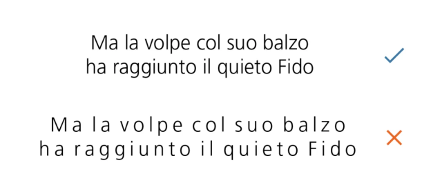
By now you have understood that tracking is also a sensitive element, which must be treated with great care and perhaps with the help of some little cunning.
That's why I'm going to present you with our advice on how to use font tracking really well in your projects.
Tips and tricks to manage font tracking well
Always be positive
This is one of the most important rules to follow if you want to use tracking really well: never set this variable to a negative value .
In other words, never reduce the space between letters and words below the standard limit .
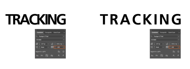
The tracking , if it has to be modified, will therefore always be "widened", never "tightened" .
In fact, if you decrease the tracking, the effect you get is a text that is nothing short of heavy and tiring to read.
One exception: the feeling of heaviness or squeezing is exactly what you want to suggest. For example, if you wanted to pretend that an entire block of text was crushed by a character or something particularly heavy, or to convey the idea of claustrophobic crowding, then you could use negative tracking.
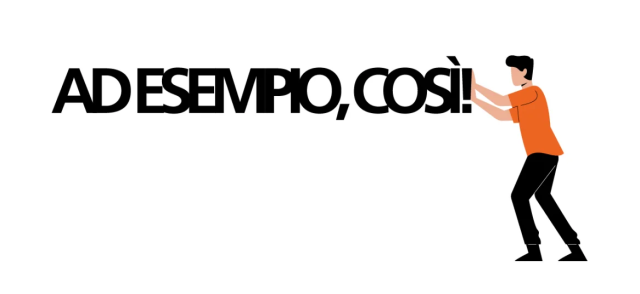
But, as I anticipated, this is an exception that only confirms the rule
Tracking yes, but only on uppercase fonts
Tiny fonts are usually designed to be readable best when they are next to each other.
Therefore, as a general rule, I advise you to increase the tracking only when you are dealing with writings in which there are all uppercase or small caps fonts .
In this sense, a phrase uttered by Frederic Goudy , the great type designer of the twentieth century, when he received an award and evidently did not like the handwriting of whoever wrote the parchment, has become famous:
"anyone who would letter space blackletter would steal sheep"
The phrase became famous and began to spread even in a version in which blackletter - gothic - was replaced with lower case - lowercase. Erik Spiekermann then took the idea for the title of his typography guide Stop Stealing Sheep (and find out how type works ) from this sentence.
It must be said that in some cases it may happen that you have a block of text that ends with a word "widow", that is, it wraps and remains alone in the line. Or at least a distribution of words that doesn't cover the surface of the text block as it should.
In this case, even if it's tiny, carefully arranged tracking can help you harmonize the visual effect of a text.
Tracking and leading go hand in hand
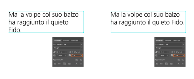
The size of the horizontal spacing must maintain harmony and proportion with the vertical spacing between lines.
So tracking and leading, or leading, are somehow related . If in a block of text you go to increase the approach then I recommend that you also increase the line spacing proportionally.
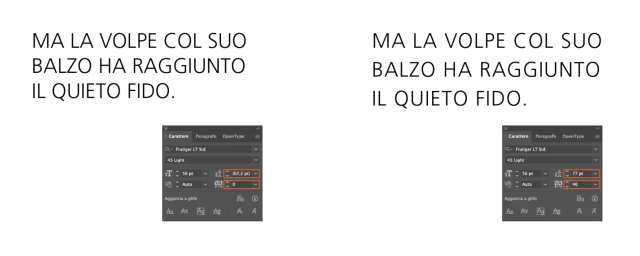
This way you will maintain or even improve the readability and visual balance of the text.
Pay attention to the dimensions
Also for tracking, as we mentioned when we talked about kerning, the size of the font on which we are going to operate the adjustments is a factor to take into consideration .
Since spacing affects legibility, our goal is to correct any problems that may arise when using a font in different sizes.
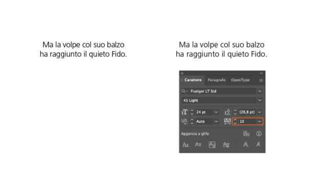
In general , at smaller sizes, readability is poorer: in this case , increasing tracking , without exaggerating, can make even small text simple and pleasant to read.
On the contrary, too large a tracking applied to a large text risks compromising readability because we find it more difficult to identify the beginning and end of words.
For each color its tracking
We mentioned that it is usually recommended to apply tracking customization only to text in uppercase or small caps.
However, there are particular situations in which the spacing can help the legibility of a text with tiny fonts in unfavorable contexts.
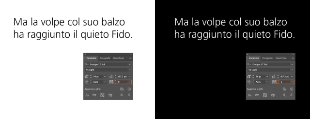
I'll give you an example of a layout that is very common on the web today: light text on a dark background . This combination , although very effective for the good use of screens perhaps in the dark, however, makes the text less readable than a black text on a white background.
This is why when in your project you find yourself dealing with light text on a dark background, even if it is in lowercase, it can be useful to increase the tracking a little to restore full legibility.
Better not to intervene at all
Intervening on tracking , as well as on kerning, can be quite a risky operation , which makes the text we are working on completely lose balance and harmony.
In addition, it must be said that well-designed fonts need this type of adjustment only in very special cases and for unorthodox uses.
In general, therefore, the advice, if you don't have very clear ideas on what to do and how to do it, is to not intervene on these parameters.
When you subscribe to the blog, we will send you an e-mail when there are new updates on the site so you wouldn't miss them.
By accepting you will be accessing a service provided by a third-party external to https://www.insightadv.it/






































Comments