
The 7 most common mistakes in graphic design (and how to avoid them).

Have you ever worked on a graphic project and, at some point, you realize that, well, something is not right ? You look at your sheet or your screen and you just don't understand where you went wrong, what's wrong.
You may have made one of the most common mistakes in graphic design , the ones I want to tell you about in this article.
Where do errors come from?
In fact, it often happens that we see very valid ideas which, once implemented , are not very convincing or not very effective . And this happens precisely because some basic rules of graphic design have not been followed; it is mostly simple techniques . If you apply them correctly, you will quickly realize that your projects will have the right impact .
But now let's see together what are the 7 most common errors in graphic design, and above all how you can avoid them.
The most common errors in graphics
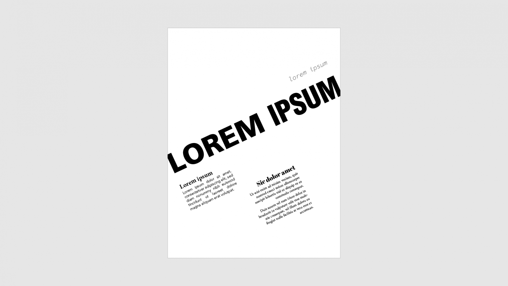
1. The lack of a focal point
The focal point is that element of our graphics, whether it's a shape, a color or a wording, which serves to capture the attention and direct the gaze of the beholder.
When the focal point is missing, our graphic design loses effectiveness , because our brain can't decide which element it should focus on first.
In practice, the focal point is like the entrance door to our project: the easier it is to identify, the more people we will be able to involve and the more people we will be able to get the right message across.
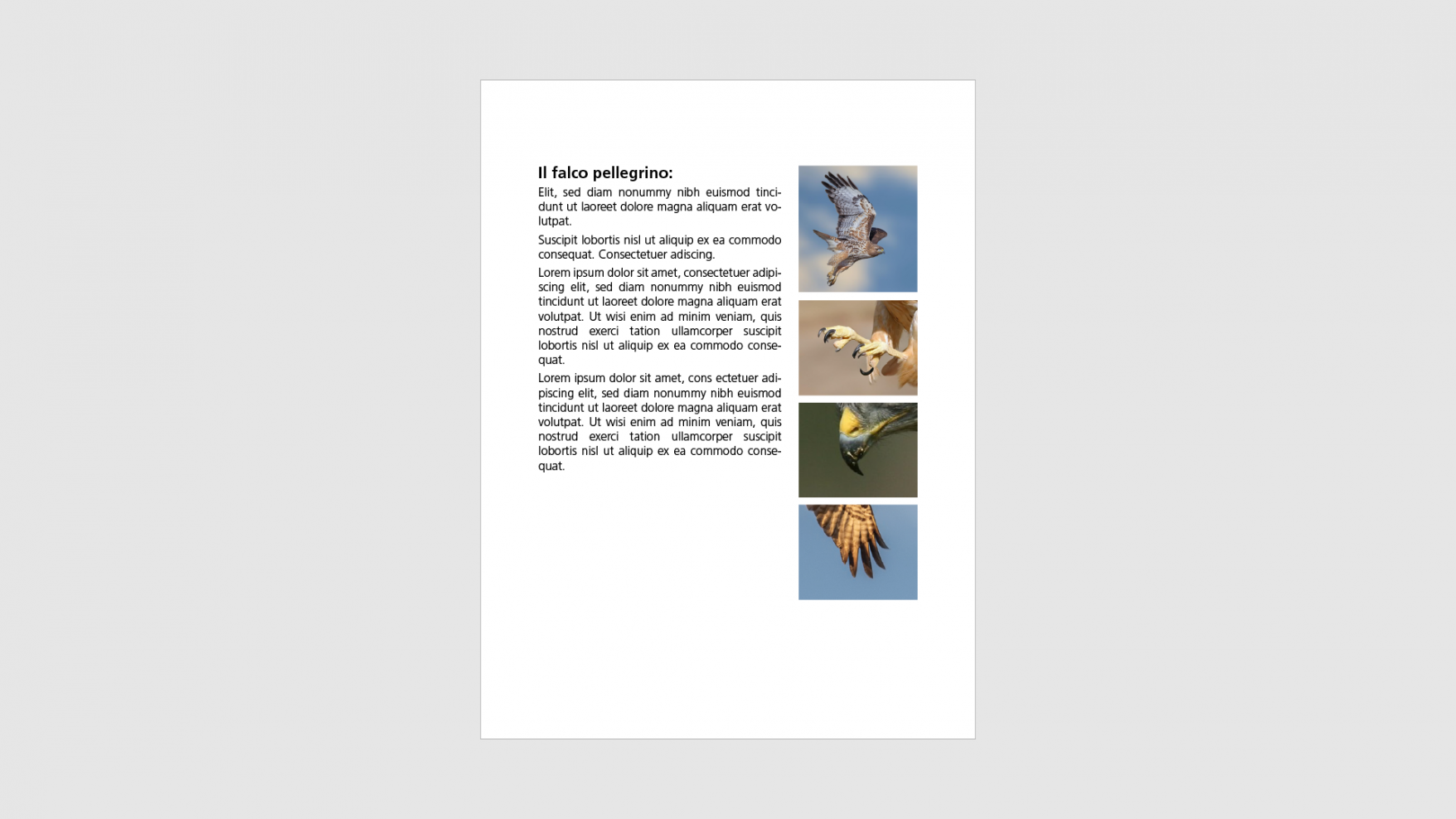
I'll give you two layout examples: the first lacks a focal point . The impression we have is one of disorder and we find it hard to concentrate on a particular element, so our attention is dispersed .
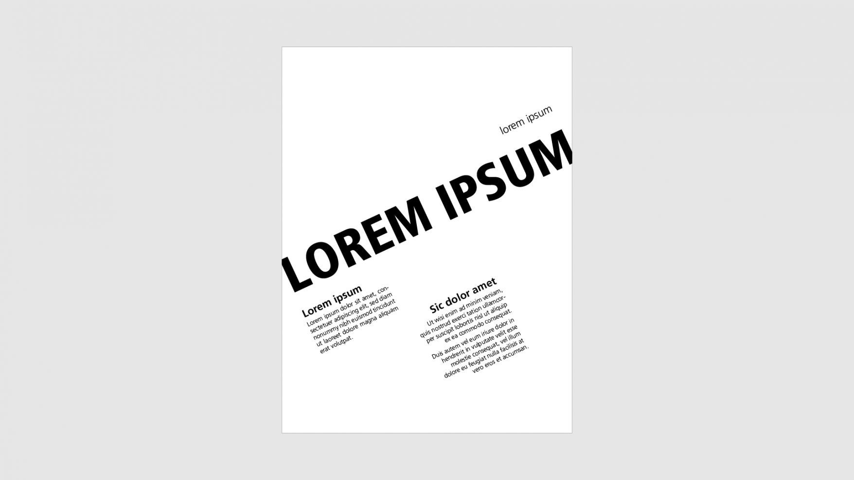
Look at this instead:
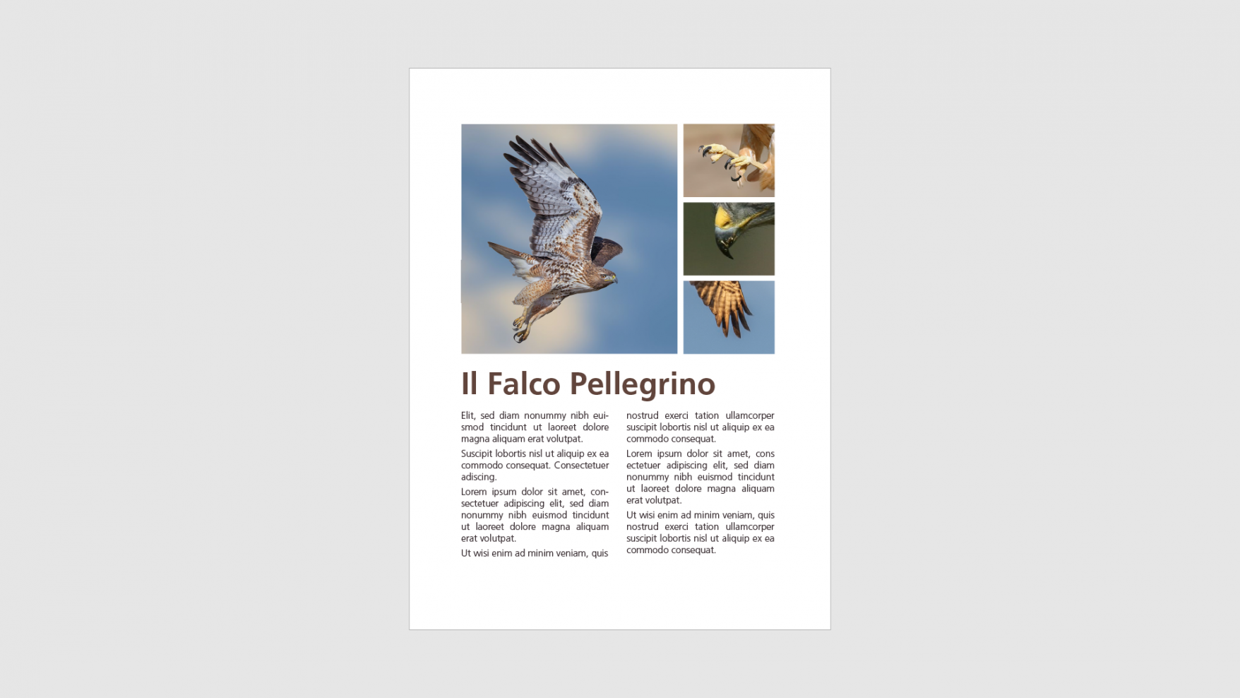
Here the focal point helps us to better understand , in a more immediate way, what is the concept I want to convey (or the topic I want to talk about) through this layout.
The focal point makes our layouts more effective because it helps clarify the hierarchy of elements , what is more important and what is less. So let's move on to the second of the most common mistakes in graphic design, which is closely related to this.
2. The lack of a visual hierarchy
Visual hierarchy is the organization we give to a layout through the different importance we assign to the various elements.
The purpose of a layout is almost always to convey a concept as effectively as possible. For this to happen, it is necessary to give an order to the different parts of the project.
You can do it for example through the colors, the dimensions, or even the weight and the choice of fonts .
Again, I'll show you two examples.
Again in the first case the lack of visual hierarchy makes it difficult to focus on individual elements. On the contrary, in the second case we have a feeling of order. It is very important therefore to learn how to build a good visual hierarchy, and to do that you need a focal point, just as the focal point is fundamental to building a good visual hierarchy.
3. The lack of white space
If the first two mistakes we have seen are frequent especially for those who are starting to deal with graphic design, unfortunately we also see this very often made by highly experienced designers.
White space, or negative space , is a very powerful tool because it allows the elements that make up your layout to “breathe” . And in the same way it allows us to focus attention on the message we want to convey, therefore above all on the focal point.
Even among the secondary elements of the layout, however, it is necessary to ensure there is the right space . In this way we can create small pauses , small positive signals for our brain that create rhythm and legibility .
Look at the abysmal difference in this comparison, for example:
4. Using too many different typefaces
Another very common mistake that risks compromising the effectiveness of your graphic layout is using too many different typefaces .
The characters, within a project, are used to convey a specific sensation and provoke a reaction in the viewer and reader. And each font you choose conveys that feeling differently.
So when you juxtapose too many different fonts, you risk creating confusion . As in this case:
Using different but very similar fonts also contributes to this feeling of disorder, because even if the difference is minimal, our brain will register the impression of something that is jarring, that does not work as it should. (indeed, it is better to combine very different from each other than similar to each other)
To build an orderly , effective layout that follows a correct visual hierarchy , in many cases even a single font family may be sufficient . In this case my advice is to play with the font weights , to get a good impact.
In general, however, it would be better not to use more than two fonts , exceptionally three.
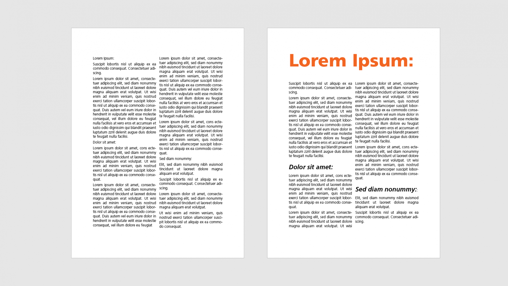
5. Texts and all elements all centered on the page
It may happen that we are faced with technically perfect layouts , or rather in which there are no obvious errors , but they seem to us not very effective .
This can happen when all elements of a layout are center aligned . That in itself is not a mistake. In fact, in these cases we still see an orderly and sensible, but banal image.
When we develop a graphic project we want to clearly communicate a message, and to do so we must capture the attention of the viewer. If we align all elements in the center once again we give little prominence to the focal point.
Look at the two examples below: the elements do not change, neither the weights nor the dimensions change. But if we try to play with the alignments we immediately notice that the result is more interesting, has a greater impact and captures our attention in a completely different way.
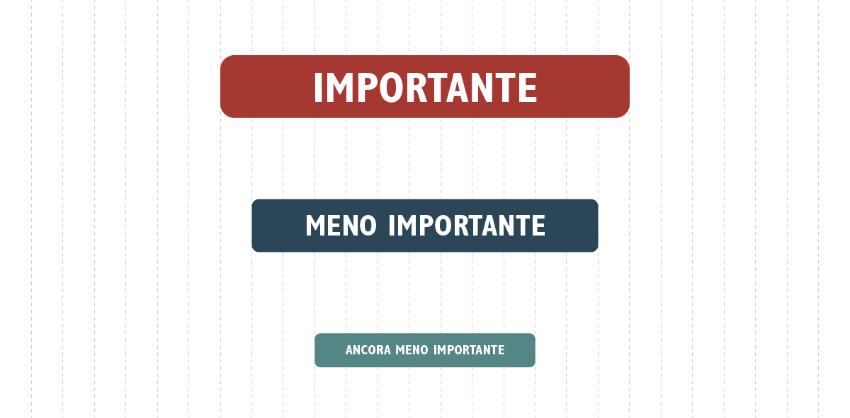
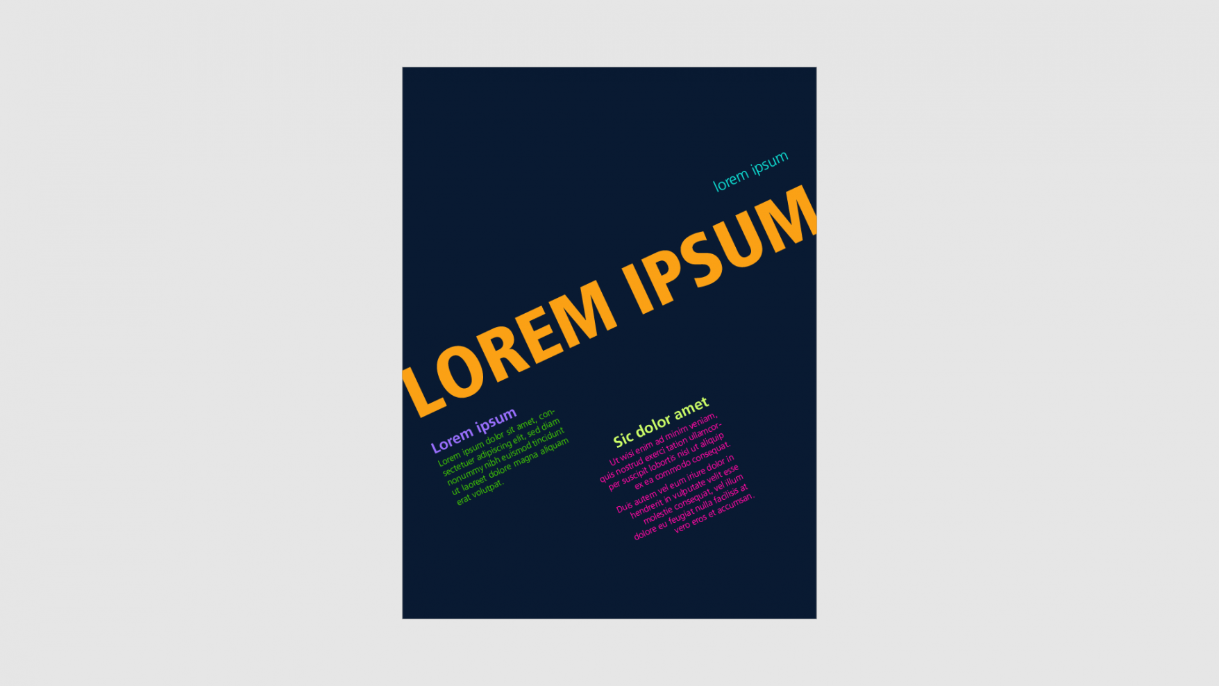
6. Using too many colors
In order not to make mistakes with the use of colors in a graphic project you must not have half measures: either many, or very few.
In some cases, in fact , using many colors could be just what you need to do. In this case, however, there must be a lot of them: in this way they create a pattern , which can be considered as a single color . The focal point will be text or a shape that stands out prominently from this colorful background.
The most serious and very common mistake is instead to use four or five colors without assigning a precise hierarchy. This produces confusing, messy layouts where attention is lost.
Usually, however, it is better to focus on two colors , one background and one that is defined as " accent ". This word really makes you understand how the color is used to focus the attention of the viewer on the elements to which you have assigned that color.
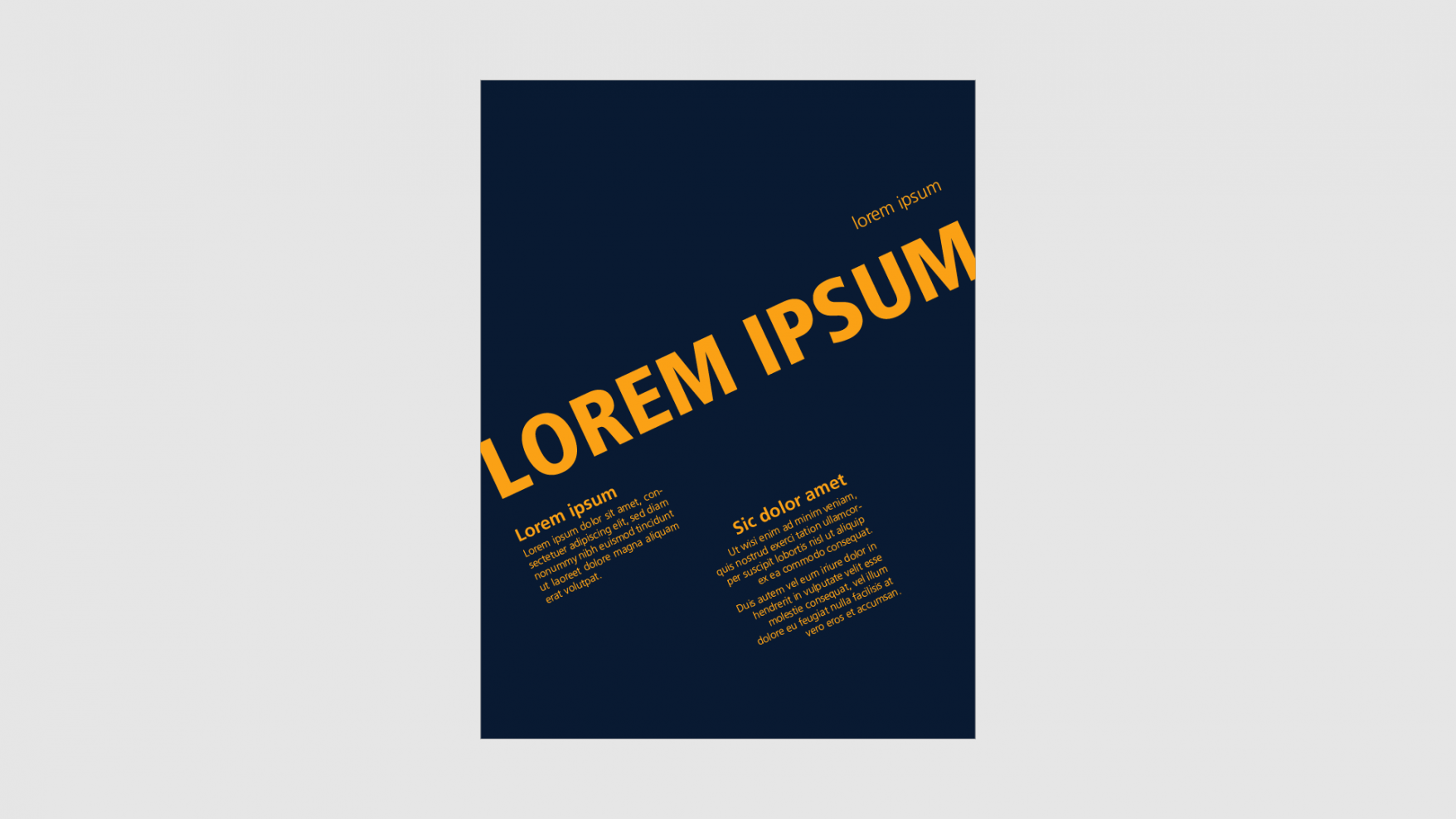
In this way you will certainly be able to obtain graphic layouts of great impact, in which the color also underlines the concept you want to convey from an emotional point of view.
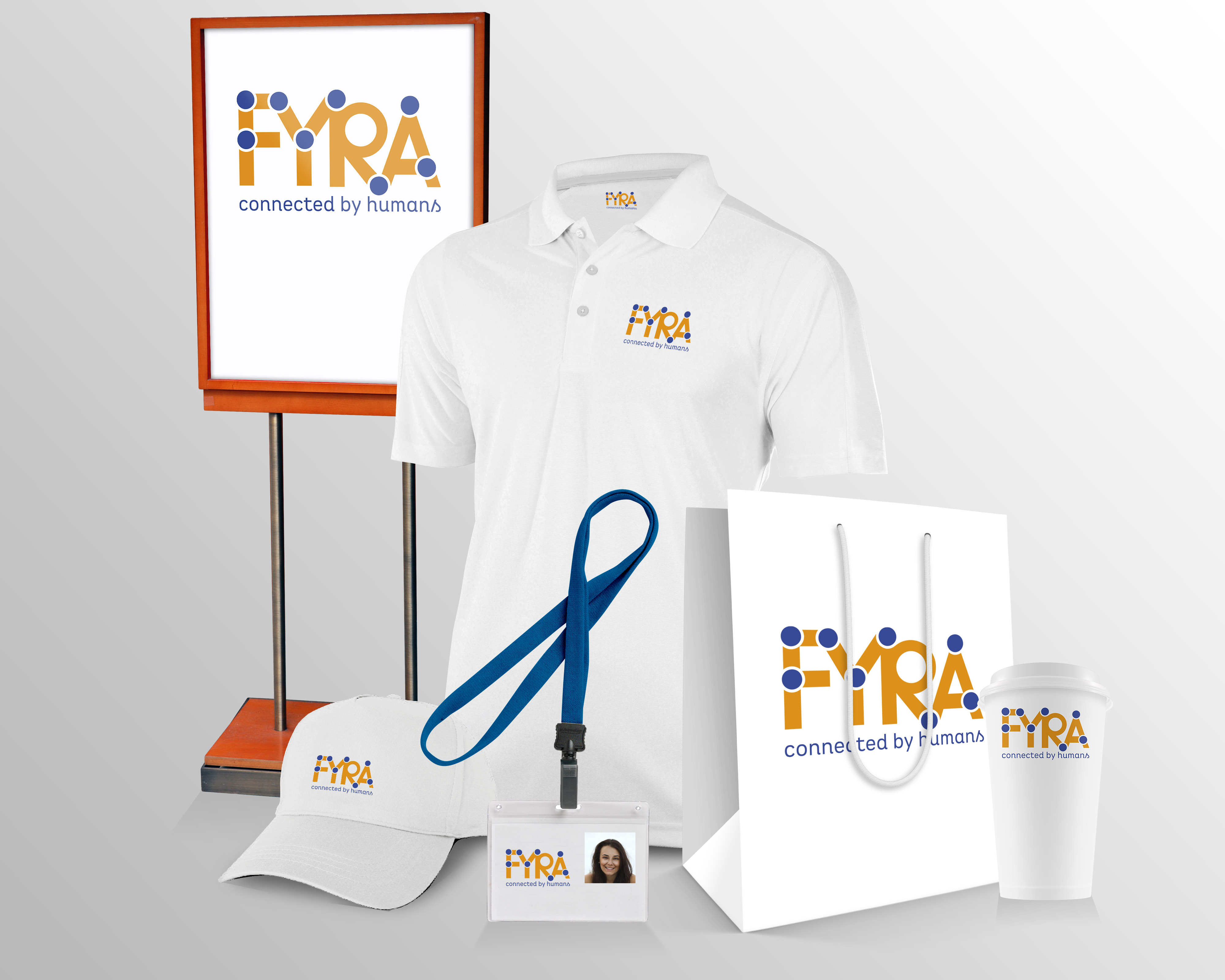
7. Mispresenting your project
Unfortunately, this is truly one of the most common mistakes in the world of graphic design. We often find ourselves in a situation where a layout, or a graphic product , perhaps a logo, has no errors or defects . It works, it's beautiful and effective.
But it is poorly presented . Maybe in a poor way, maybe with naivety.

Thus it happens that a well-made logo is difficult to read because it lacks the emptiness necessary to grasp the shapes well.
Or, another example, is when a correct and effective project is not understood by the client because he/she cannot imagine its concrete application.
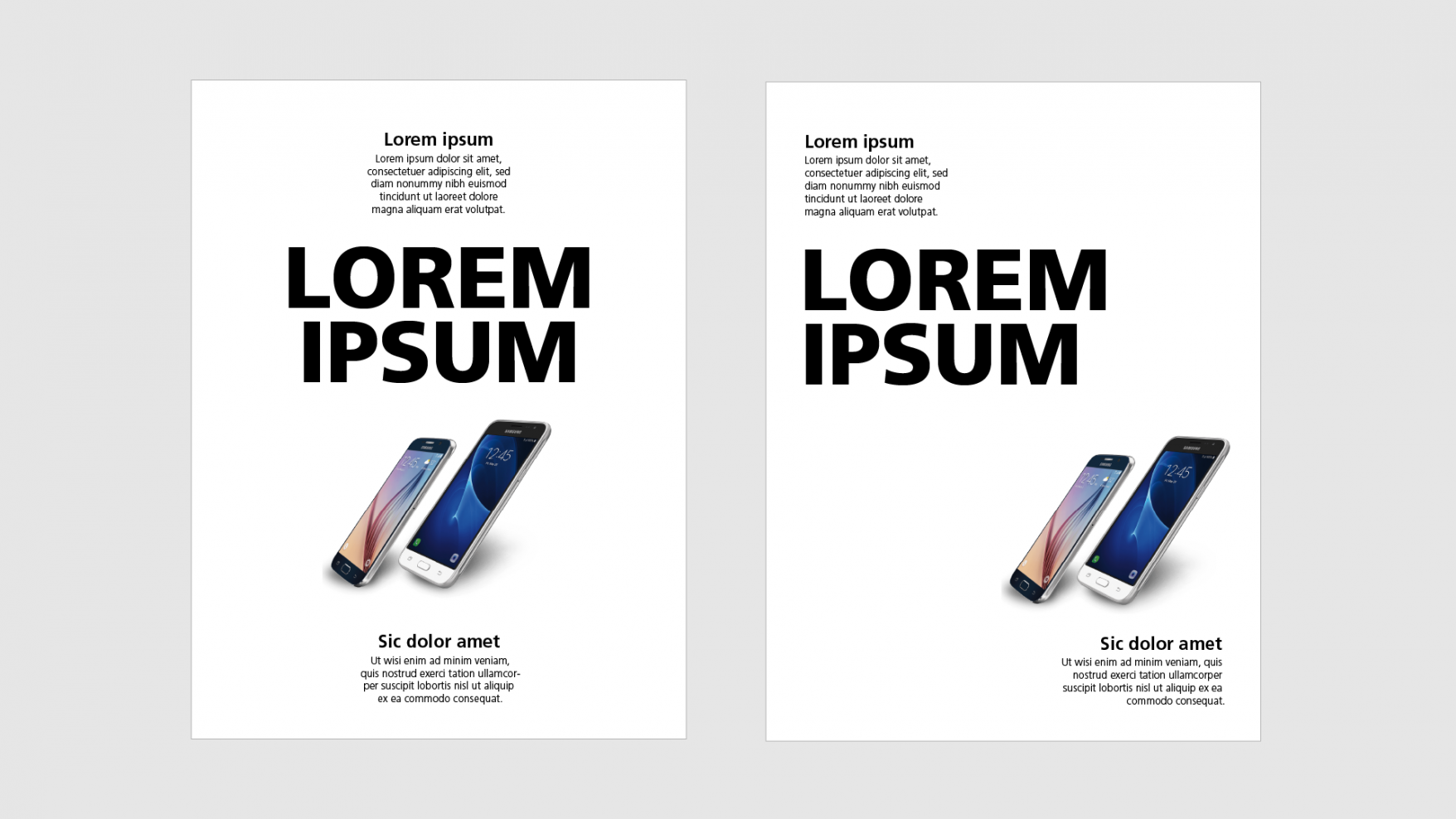
To avoid these problems, the advice I can give you is to use mockups when possible.
In this way, whoever requested the work has the possibility to get an idea of how the layout you have created can work on the objects for which they are designed.
A page, a cover, a poster, a t-shirt: thanks to the mock up we can make the result of the finished product clear.
Conclusions
As you have seen it is really quite easy to learn how to avoid these mistakes . It takes a little attention and practice . And you will see that your projects will have the effectiveness and quality you are aiming for.
Here I have entered the 7 errors that I have seen most often, but I probably forgot some . Can you think of any others? You can suggest them in the comments, and maybe we'll talk more about them next time.
When you subscribe to the blog, we will send you an e-mail when there are new updates on the site so you wouldn't miss them.
About the author
By accepting you will be accessing a service provided by a third-party external to https://www.insightadv.it/


Comments