
How do you prepare a file for printing?
I start this article by telling you a story. The story of a young and inexperienced graphic designer struggling with the printing of a flyer , who talks on the phone with a printer.
The young graphic designer had sent the pdf of the flyer via email, leaving his telephone number in case of need. After a short time, the young graphic designer is contacted by the typographer who informs him that the color profile was wrong and had to be converted to CMYK , that, being a full bleed print, there was a need to have an abundance and that, furthermore, there was also some glitch with the fonts .
As a result, the young graphic designer found himself having to completely (or almost) redo the project in order to be able to follow the advice and guidelines of the very patient typographer .
This story which, as you will have understood, is something that happened to me personally , probably happened to dozens and dozens of graphic designers when they approached the world of printing for the first time, thus leaving the comfort zone of design digital to which we are all accustomed by now.
In this article I really want you to learn from my mistakes and avoid scenes like the one I told you about. I have therefore compiled a series of tips and aspects to keep in mind when designing a file for printing.
So if you want to better understand how to prepare a file for printing, you're in the right place.
Okay, ready? Then let's go!
Ok, before going on to tell you some important things to always keep in mind about preparing a file for printing, I want to tell you what I think should be the "golden" rule for a designer who has to print: talk to the printer , talk to who will print your file!
This is important above all because he will be able to give you useful information on how he wants your file (certain formats or certain types of prints require different attention and a typographer/printer knows them).
These indications will be useful for you to make the necessary corrections before making ammuina , i.e. mess, (and I say it in Neapolitan to underline the thing!) And they will also be useful for saving time in future jobs.
If, on the other hand, you turn to online printing services, the comparison will be much more difficult and less personal but will often be replaced by templates and guides to follow to meet printing needs.
In any case, let's go straight to the things to keep in mind when preparing a file for the printing process!
First: the colors!
Colors are the first thing you need to pay attention to when printing your work. You always have to worry that the color you choose is printed with the yield you need and that the right shade comes out of it to avoid important mistakes.
For example, imagine if he were wrong to change the print color, I don't know, of a series of packs of Barilla pasta? Instead of the blue with which everyone immediately recognizes the pasta area in the supermarket, a slightly lighter blue. That would be a marketing disaster, right?
CMYK vs. RGB
Very first thing. Do you have to design something that will need to be printed? Design it using CMYK color profiles, the so-called four-color process, i.e. the colors that are used in printing.
This is because not all RGB colors have a direct correspondence with the CMYK ones and you risk making the ammunition I was telling you about before finding yourself in front of colors that are completely different from those on which you had built your graphics.
Insight: color profiles, characterizations and paper types
Unless a project requires different specifications, it is always good to work on color profiles derived from the Fogra39 characterization, such as the color profile already preset on Adobe, Coated Fogra39, based on the ISO 12647-2 standard of 2004 for glossy coated paper , wood-free ( Gloss-coated, wood-free – paper type 1) and for matte coated paper ( Matte-coated, wood-free – paper type 2).
Different color profiles are used when working on different types of paper. I am writing you a brief summary of the color profiles with their characteristics and type of paper.
- Type 1 paper is Gloss-coated, wood-free . Its characterization is Fogra39, which follows the ISO 12647-2:2007 standard. It has the ECI (European Color Initiative) color profile: ISO Coated v2 (ECI), while on Adobe programs it corresponds to the color profile Coated FOGRA 39 (ISO 12647-2:2004).
- Type 2 paper is Matte-coated, wood-free . (same characterization and color profile as type 1 paper).
- Type 3 paper is Gloss-coated, web . Its characterization is Fogra28, which follows the ISO 12647-2:2004 standard. It has the ECI (European Color Initiative) ISO Web Coated color profile, while on Adobe programs it corresponds to the FOGRA 28 Web Coated color profile (ISO 12647-2:2004).
- Type 4 paper is Uncoated, white . Its characterization is Fogra29, which follows the ISO 12647-2:2004 standard. Its color profile is ECI (European Color Initiative): ISO Uncoated, while on Adobe programs it corresponds to the color profile Uncoated FOGRA 29 (ISO 12647-2:2004).
- Type 5 paper is Uncoated slightly yellowish . Its characterization is Fogra30, which follows the ISO 12647-2:2004 standard. It has an ECI (European Color Initiative) color profile: ISO Uncoated Yellowish.
Black or black black? (or black black black black… um)
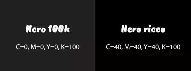
There are many shades of gray black but, when printing, we tend to define "classic" black as that given by the CMYK composition 0;0;0;100, i.e. with 100% black ink and that's it. However, there are different shades of black which, when printed, produce a richer black.
Rich black , in fact, is created simply by adding the percentages of ink of the various colors to give more richness to the black, making it brighter and less "dull".
In the past, you will surely have seen prints with full shapes with a slightly dull and not brilliant black. Well, it was almost certainly a non-rich black man.
One of the most classic compositions of rich black is C=40, M=40, Y=40, K=100 but there are many variations such as Cool Black (70,30,40,100), Warm Black (35,60, 60,100) or the Rich Black Fogra39 (91,79,62,97).
Obviously (if not, what's the point?) each machine or type of printing and paper has specific characteristics which make it important to consult with the printer to find out which type of black is best to use according to the project or the paper used (for example paper used for newspapers does not handle excessive amounts of ink).
In fact, if for texts, traces or linear elements classic black is always fine without any problem, when we talk about using black as a fill, the situation changes and it becomes very important to use a rich black.
To recap:
- Texts, traces and lines : black K=100
- Full forms : rich black, where 40,40,40,100 is almost always right but, if you have any doubts or if you are working on a particular type of print, try to clarify the matter with the printer!
Try to make some test prints to test the color
When you are dealing with projects of great importance, perhaps for demanding customers or for which the highest possible quality is needed, it is a good idea to make test prints to verify that the color yields are as desired.
This is very difficult if you are dealing with online printers but it is certainly easy to do in person with printers and printers with whom you may have already had working relationships (that important designer / printer communication I told you about!).
Often doing a color check allows you to notice mistakes you hadn't considered and avoid compromising the entire job.
Box/marks/bleed
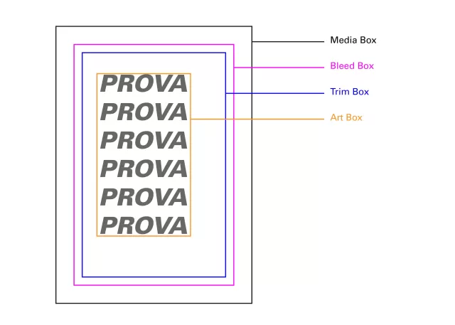
In a file intended for printing there are different types of boxes, containers for graphic elements. Lines within which to design your own poster, flyer, business card or whatever.
In particular there are:
- The Media Box , which defines the dimensions of the support on which it will be printed (a graphic designer, however, does not care);
- The Bleed Box , i.e. the limit within which to insert the graphic elements and in which to send those that must be "bleeded" (or full bleed, as they have pointed out to me, they say more often), as we will see in a moment. It is the line along which the sheet is cut during production;
- The Trim Box is instead given by the line that defines the page after the final cut and is usually defined by the so-called crop marks;
- The Art Box is the space in which the internal graphic elements are inserted which must not be bleed (or bleed, again), it is usually good to leave a few millimeters (usually 5 millimeters) between the Art Box and the Trim box , to avoid possible problems in the production phase.
When preparing a file for printing, you must always consider the fact that the sheet on which it will be printed will be cut along the bleed and also along the trim to ensure that any colors or graphic elements reach the edge of the sheet, i.e. that they are full bleed .
Enlarge the graphic elements towards the bleed
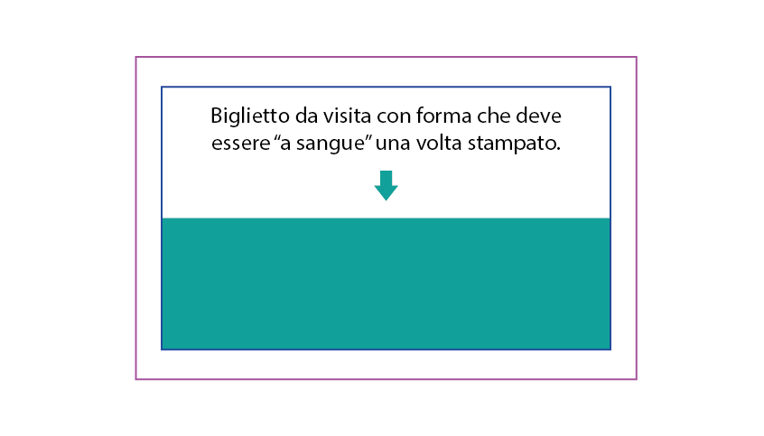
This aspect is probably one of the most important and it's one of those things that no one has ever taught me, I had to learn it in the field through mistakes.
To prevent your prints from having unwanted white space around them, an effect that gives the idea of something printed at home with a 25 euro printer bought with gas station points, always, always, always remember to bring all the elements charts that are meant to be bled beyond the trim line and up to the bleed line .
Yes, ok Umberto, but how do you know where to place the bleed line when designing a file?
The amount of space between trim and bleed is not a standard factor but depends on the print type and format.
Generally 3 millimeters is enough for jobs up to A4 size (therefore flyers, business cards, brochures), while beyond that it goes towards 5 millimeters or even more. For large print jobs (for example window stickers) of which you are not 100% sure of the millimeter measurements, it is advisable to leave even a few centimeters.
Font
In addition to managing colors and paper format, when printing you need to be careful in managing fonts and images in the correct way. First of all let's talk about fonts.
The most important thing in managing fonts is knowing when and whether to convert texts to paths. Not everyone agrees on this, but I think you should NEVER convert fonts to paths.
The only exceptions are when it comes to logos (logos made up of writing), fonts used in an artistic way, for example in a graphic composition or large-sized titles that must absolutely maintain certain characteristics without the possibility of being modified. Stop.
All other texts, especially long texts, must not be traced at all . This used to be done because many machines, tools, and software either didn't read some font file formats or didn't recognize them. Converting them to a path was a workaround to avoid compatibility problems.
It is now very rare to encounter problems of this type and, for this, there is no need to convert fonts to outline.
Indeed, it is a harmful modification, for these reasons:
- Text is no longer editable once it is turned into a path.
- The file with paths is much heavier and, moreover, you always have to keep another copy with the fonts not traced in case you need to change (and 9 times out of 10 it is).
- Sometimes drawn fonts lose legibility on certain on-screen pdf readers.
Images
Another important aspect is that of the images that you will insert in the print file.
First of all these images must be of high resolution . And that is, no, the famous 300 dpi resolution that is often mentioned inappropriately has nothing to do with it. By high quality image I mean a large image (in terms of pixels or millimeters) and high quality (basically: no grainy stuff).
If you don't know where to get the images from, avoid downloading them from Google images because, first of all, they are protected by copyright (most of them), and secondly, they are almost always of a resolution that is not suitable for printing needs. Instead, use stock photo sites, whether they're free like Pexels or paid like Adobe Stock or Shutterstock!
Another aspect to check when preparing a file for printing, in short, when exporting the PDF for printing, is that the images used must be in CMYK instead of RGB. The question is always the same, you have to avoid that, once the project has been printed, you get different chromatic results from the desired ones!
So if you want your images to have the color you expect, convert them to CMYK!
There are many possible problems when converting an image file from RGB to CMYK, one of them is when dealing with RGB colors that are out of gamut in the process. That is, when a color present in the RGB color scale has no correspondence in CMYK and therefore cannot be reproduced.
In one of the next articles, I will tell you more about this aspect, with the necessary explanations and some solutions. At the moment it is enough to know that you have to be careful in this conversion step, making sure to always save a copy of the original image and to work on any retouches and modifications before the conversion (trying, for example, to reduce the negative effects.
I make a correction. You don't have to convert images from RGB to CMYK while you're still working on, for example, an InDesign file. The important thing is that when exporting the PDF, that PDF is exported in four-color process and Adobe will take care of converting all the images within the file.
There will be no difference in converting the image before or after exporting the PDF.
Finished? Double check everything!
OK, these are the main aspects to always keep in mind when working on a project intended for print. Remember that they are all very important aspects and that it is always good to check as much as possible.
- Have you used only CMYK colors respecting the right color profiles for the type of paper you are going to print on?
- Did you use the right blacks? 100k black for text and paths and rich black for fills and filled shapes?
- Have you designed your file taking into account the various boxes?
- Did you bring the bleed elements of your project up to the bleed line?
- Did you leave the fonts "alive" without converting them to a path?
- Did you only use high resolution and CMYK images?
- Have you asked your printer for confirmations for highlights that left you wondering how to proceed?
Ok, then you're ready to print! ;)
Some books to learn more
If you want to delve into the subject (and there is really a lot to delve into) on what concerns colors and printing, my advice is to go and read some books about it. Among the many, I absolutely recommend these:
- Graphic design. Principles of design and applications for print, animation and the Web by David Dabner and Sandra Stewart, a book that, in addition to talking about graphic design for print, also deals with other very important aspects of graphic design as the title suggests. Suitable for beginners ONLY.
- Digital printing Start Up Guide by Harald Johnson, really a bomb! Complete, useful and professional. The only flaw: it's only in English!
- The art of colour. Practical guide to the use of colors by Betty Edwards I recommend it instead if you are interested in deepening the study of colors, uses and practical applications
When you subscribe to the blog, we will send you an e-mail when there are new updates on the site so you wouldn't miss them.
About the author
By accepting you will be accessing a service provided by a third-party external to https://www.insightadv.it/


Comments