What are the elements of a font?
In this article I have introduced the subject of fonts and typography. I also told you about serif and sans serif and therefore about font families, how they are divided and how it is preferable to use them.
As I anticipated in the previous article, there are a lot of other things to know about the elements of a font. For example: what elements make up a character? What is the difference between tracking and kerning? They are the same thing? And again: eyelets, contrasts, alignments and line spacing. As promised, we will delve into them today in this article.
The elements of a font
I continue this journey inside typography by analyzing the different elements of a character, starting from the main ones.
In the following example I have chosen to use one of the most used serif fonts both on the web and in print, namely Georgia, one of the most legible and famous serif fonts.
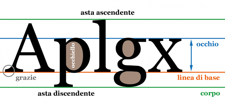
As you can see from this diagram, a font is primarily determined by some horizontal lines that define its various heights.
The green lines, called ascending line and descending line respectively, define the body of a character ; that is, the maximum height that the line of text will have in relation to the letters used. The body of a character therefore includes both the ascending rods (such as those of the letters f,l,t,k), and the descending rods (such as those of p,y,j), in addition to the eyelet or descending rod of the g, depending on the font used.
The baseline and the ascender line form the so-called height of the capital letters , which does not take into account the descenders.
The eye of the character , in English X-height , height of the x, is the height of the letters that are not capitalized and do not have ascending or descending shafts such as x, a, e, etc.
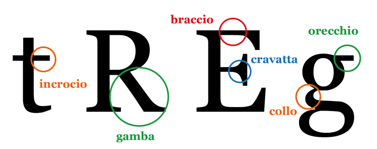
Arm, leg, tie, ear, cross, neck. They are other important elements of a font . Instead of wasting so many useless words, I think it's much more immediate to explain it through this concise graphic, always using Georgia as the font.
Until now I have concentrated only on the structure of a character and on the elements that compose it, however there are some elements of a font that tend to characterize it and give it a certain imprint, as well as making it transmit certain visual and therefore emotional sensations.
First of all there are the serifs , I've already explored the serif/sans serif topic in the article on the basics of font and typography !
But in addition to the graces, the characterizing elements are also others. Let's see them.
The contrast in a character
One of them is the contrast of a font. Font contrast is basically the difference in thickness between thick lines and thin lines. The higher the ratio of thick to thin lines, the higher the contrast value.
Resuming the principle of contrast in the context of Gestalt theory , a font with high contrast in the letters is much more readable (and in some cases even more elegant) when used in large sizes, while a low contrast one guarantees good reading even for small bodies.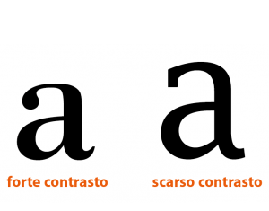
In the example above, Bodoni MT is a classic example of a high contrast font, while Lucida Fax has less contrast.
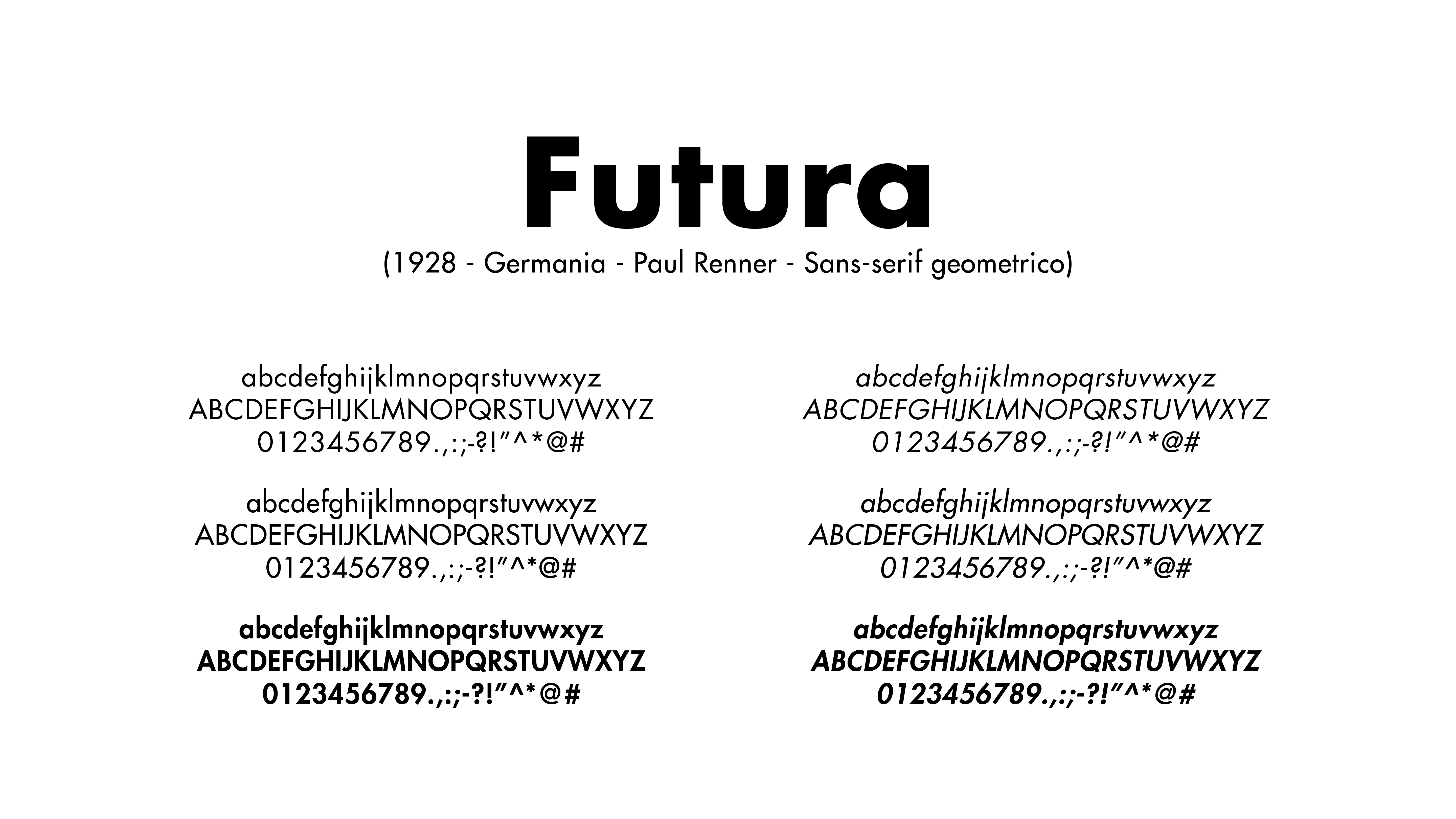
There are a number of sans serifs where the contrast is reduced to almost imperceptible as in the case of the Futura .
The importance of eye size
The size of the eye of a character, i.e. the width and height, compared to the body, of the same, is among the most important elements of a font and certainly one of the most distinctive.
The size of the eye is also useful for defining the good or poor legibility of a text written using a given font.
It is no coincidence that some of the most legible fonts that exist, such as Verdana, Times New Roman and Helvetica, have very large and well-defined eyes in relation to the body.
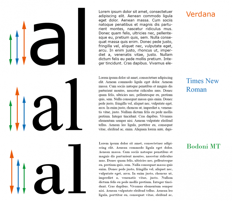
In the image above, three famous characters and their eye sizes are compared.
Texts with characters in 12pt size, equal justification and line spacing are also presented to demonstrate how the legibility factor is closely linked to the size of the eye
The first is Verdana , designed by Matthew Carter in 1996 for Microsoft, considered by all to be the best font in terms of readability and in fact the eye of Verdana is extremely large.
It is also easier to read in long texts than another "big" legibility, namely the Times New Roman , by Stanley Morison and Victor Lardent designed in 1931 for The Times.
The legibility and size of the Bodoni eye, by Giovan Battista Bodoni in the 18th century are clearly less, which, however, it must be said that in large dimensions it guarantees an elegance that Verdana and TNR will never have.
The use of Kerning and Tracking
![]()
Let's start by saying that kerning is essentially the process of managing the space between two individual letters within a font, while tracking is the management of the "total" space between all the letters and words of a font .
Kerning is used, in the creation of a font, to make the composition more harmonious and easier to read.
Why? Because, although the printed characters of the Latin alphabet have always been designed to have automatic mechanical spacing, some letters, when placed side by side, create visual effects that are not optically pleasing.
In fact, if we tried to place some letters side by side in a mechanical way and with homogeneous spacing, such as A and V or A and T, the characters would appear too distant, creating an unpleasant effect that would strain the eyes during reading.
To avoid this discrepancy, our letters are therefore brought closer to each other in a more marked way than others, obviously without joining or overlapping them.
This results in a more fluid visual composition.
Instead, a distinction must be made with tracking , a term which, as mentioned, indicates the "total" spacing between letters and words .
By increasing or decreasing the tracking (in Italian spacing or approaching) all the spaces between the various characters are proportionally modified at the same time .
Therefore, if with kerning only the calculation of the space between the single pairs of letters is modified and managed, with tracking the global spacing of the whole text is modified.
A well-calculated tracking is of fundamental importance, in fact it allows the brain to guarantee a rapid identification of the beginning and the end of a word in a text and therefore greater readability.
When you subscribe to the blog, we will send you an e-mail when there are new updates on the site so you wouldn't miss them.
By accepting you will be accessing a service provided by a third-party external to https://www.insightadv.it/









































Comments