
What makes a quality font?
To understand when a typeface is of good quality and that is well designed, you must first of all understand that within Type Design , or rather the design of fonts, there are countless technical aspects to consider , which contribute to the final result of that font .
We talk about things like the amount of styles , typographic variations like bold, italics, black, thin, small caps…
But also things like space management and therefore kerning, tracking and line spacing.
All the proportions between the various glyphs, between the vertical and horizontal rods.
Or even the management of the Open Type characteristics of a font, necessary in 2019.
These are all functional, technical and aesthetic aspects that help us understand how high quality a font is or not.
The knowledge necessary to build a complete and well-made font is vast and is not limited only to aesthetic or stylistic choices .
Technical aspects to analyze
A first way to understand if a font is of quality or not is precisely to check if, within it, there are these technical and design characteristics … but that's not all!
A typeface, to be considered of quality, obviously also needs to respond to certain aesthetic characteristics .
And this is where it gets a little more complex. Because if, on the one hand, the technical aspects are easily analyzed and identifiable, the aesthetic canons are more subjective. But this is not entirely true.
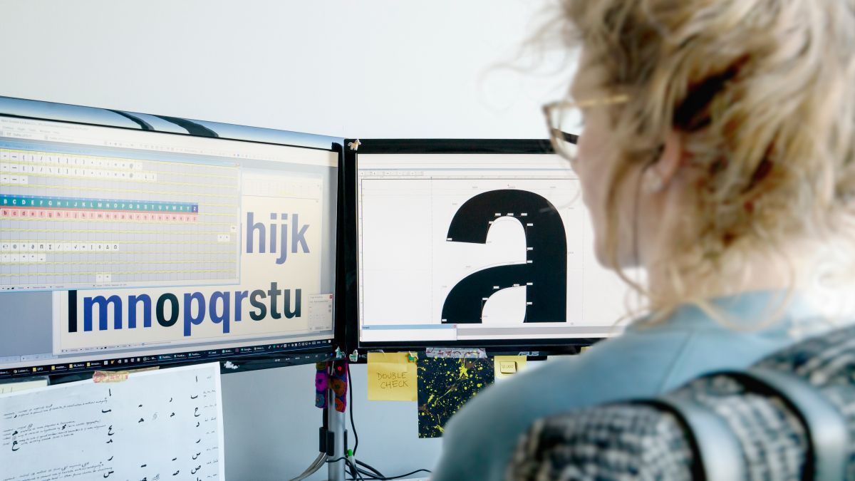
Before starting, I warn you that I won't explain every single typographical term in detail, I have already done it inthis article.
Now, let's focus on some technical aspects that I personally use to check the quality of a font .
Glyphs must be well designed
The first thing to do is look at and analyze the individual glyphs . There are certain characteristics that make a typeface quality or not.
The thing to look at is how consistent the various glyphs are stylistically and design-wise .
Individual letters must communicate equally throughout the typeface.
To do this kind of analysis, there are a few tricks that type designers have been using for hundreds of years.
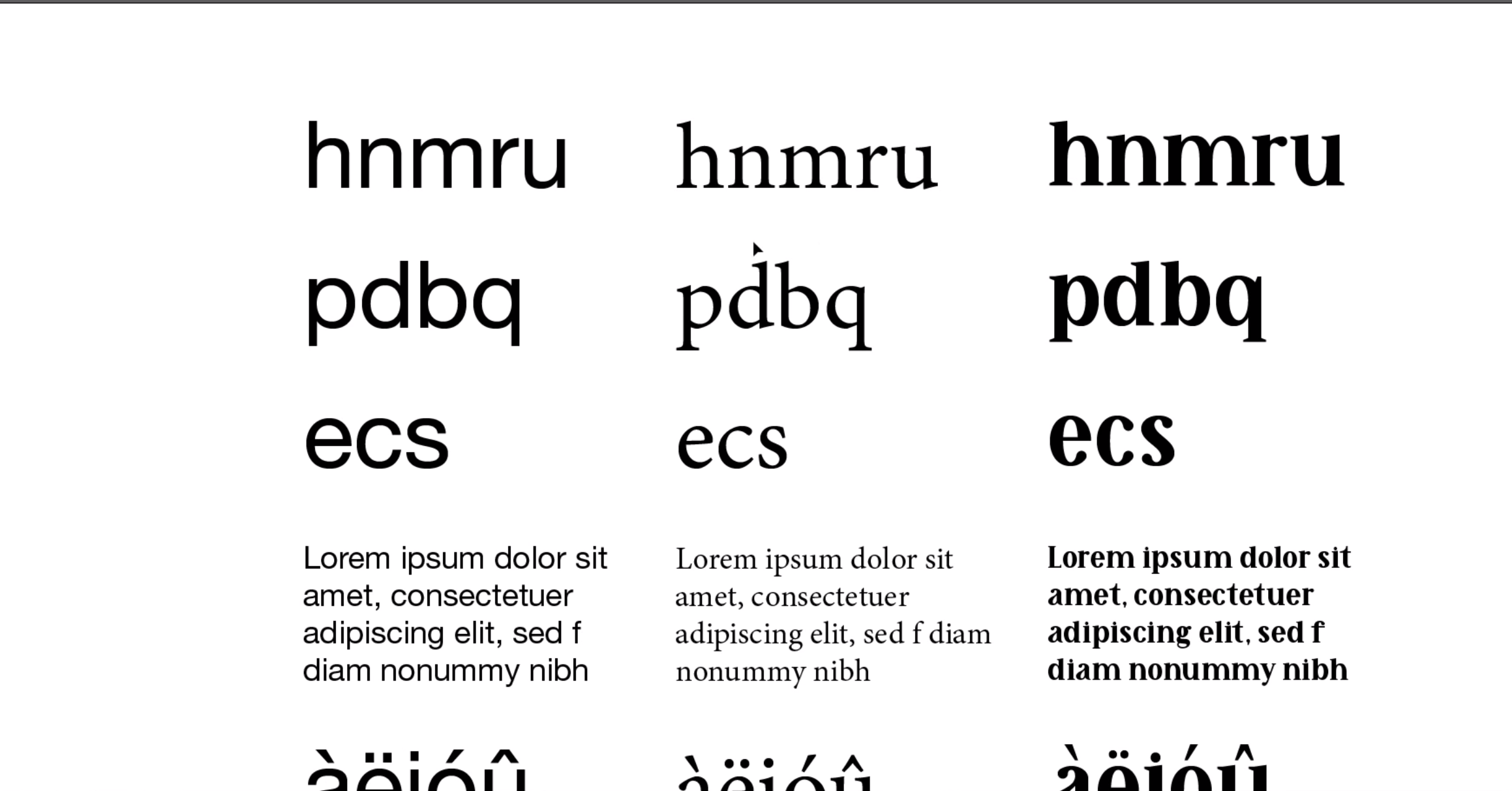
For example, there are some letter groups that are designed using the same compositional elements , such as h/n/m/r/u. As well as b/d/p/q or capital letters like O/Q/C/G, which have similar structures and curves.

It is precisely this set of elements that make up the backbone of a typeface.
When you go to analyze the quality or otherwise of a font, you have to look for that repetition of those shapes , those curves, that thickness of the temples. In this way, when reading a text with a quality font, a sense of rhythm is perceived . There is nothing out of place.
Furthermore, one way to analyze the design consistency of the glyphs is to compare some of the details and elements that compose them.
The graces must be visually consistent
In a quality serif font, for example, the serifs must all be visually the same or at least consistent with each other .
And the same goes for the punctuation, the eyelets, the thickness of the temples, the ends of the temples and, in short, all the details.

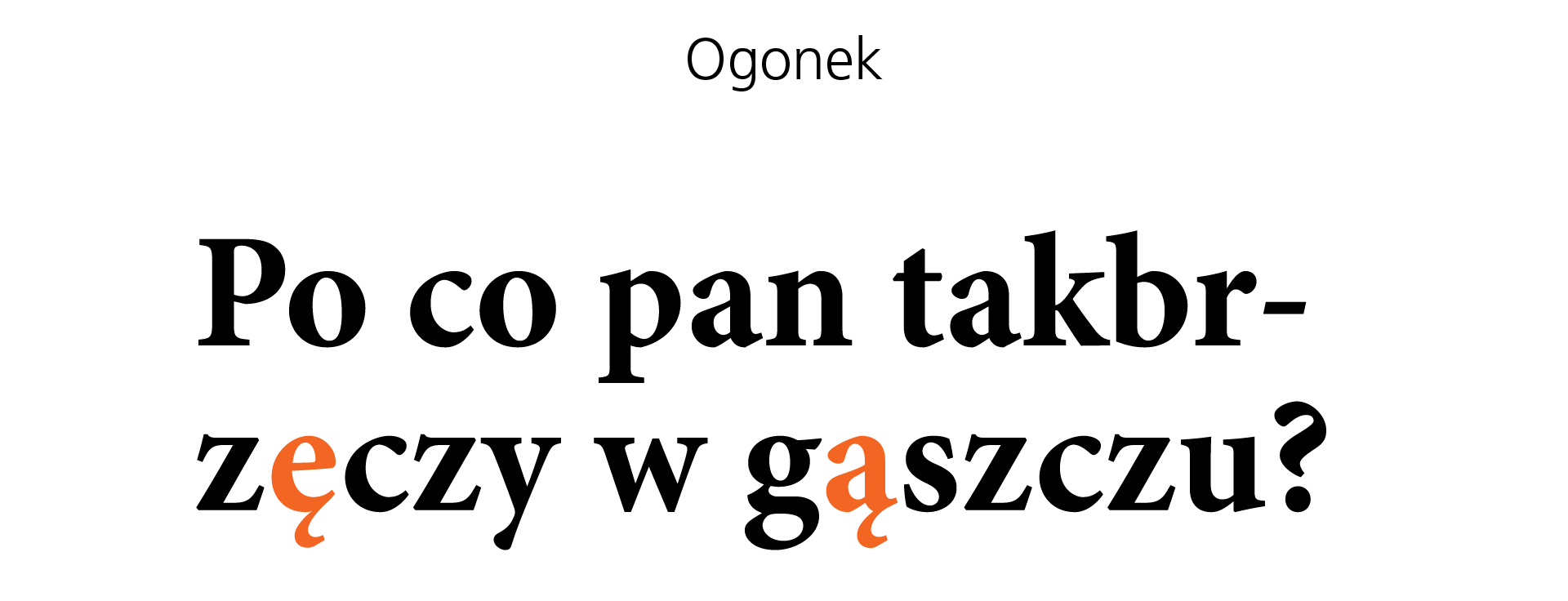
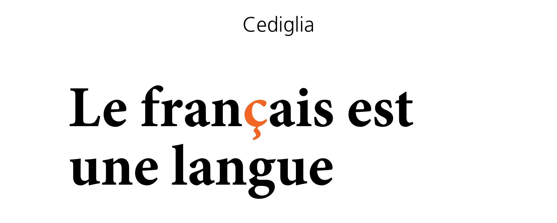
Diacritical marks must be well balanced with each other
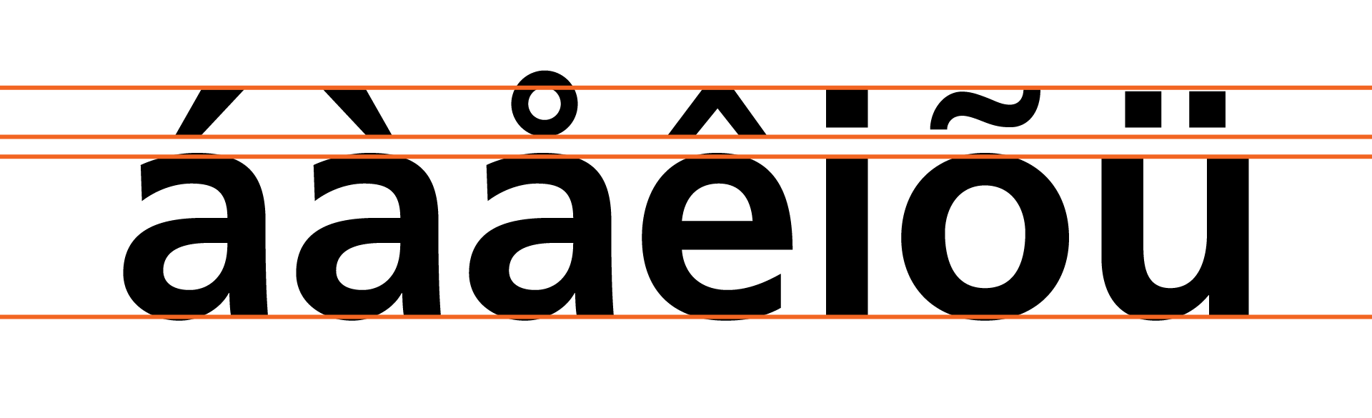
Another thing I always watch are accents and diacritics , especially those of glyphs not commonly used in Italian or English like carets or other rarer elements like ogonek , macron , cedilla or others.
If these elements are also well designed and balanced , following the same aesthetic principles and with attention to detail, it is often an excellent sign of quality.
The amount of glyphs
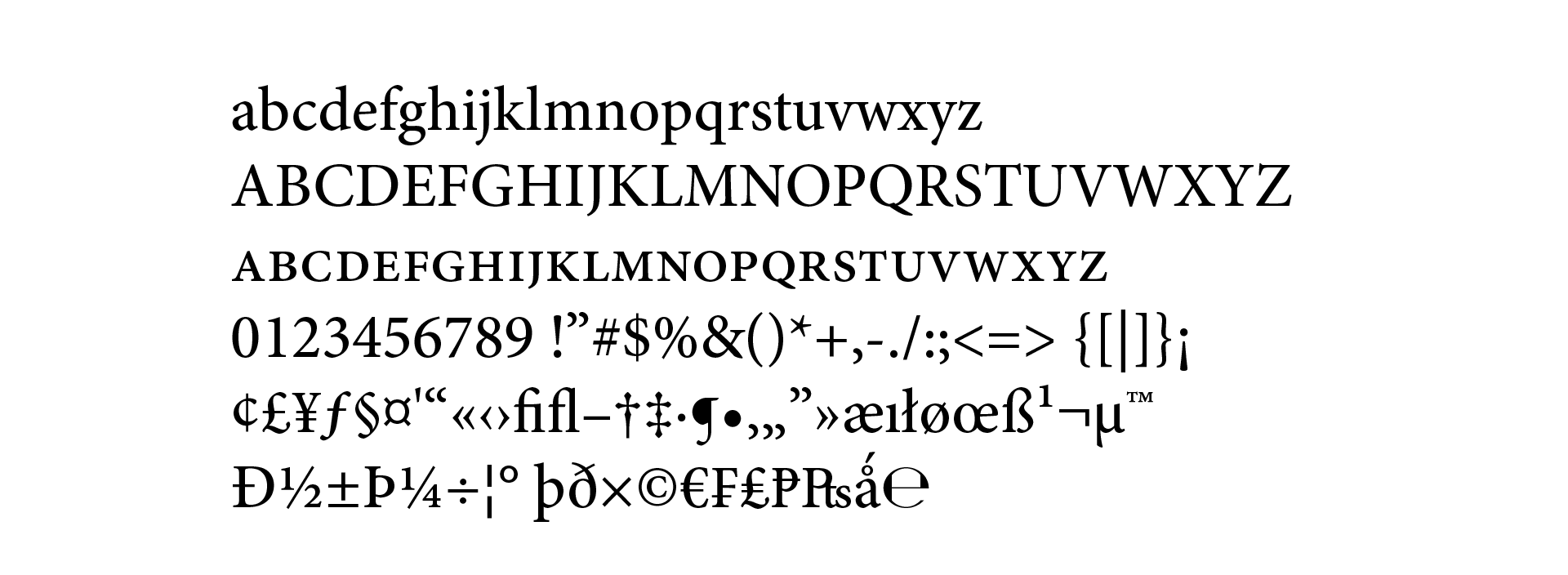
I also always carefully evaluate the amount of glyphs contained within a given typeface.
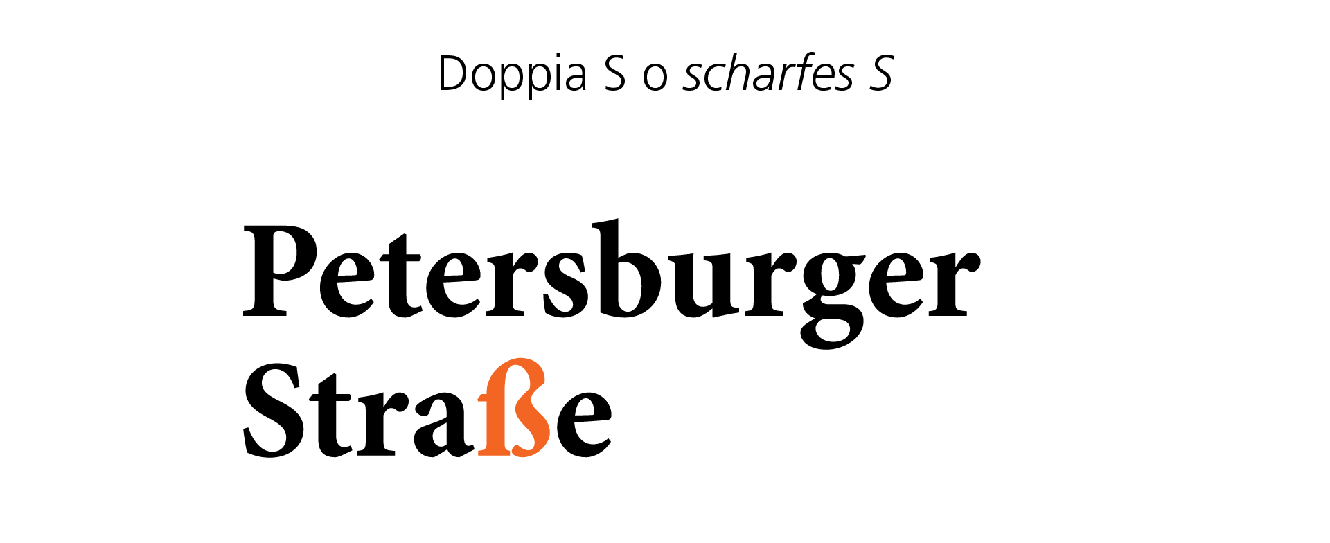
Having many glyphs is not a collector's habit , but it is simply a tool that makes the font to be used flexible , as it makes it adaptable to all the various languages that use those specific glyphs or diacritical marks. For example, German uses the double S (or scharfes S ) ß, Polish, the ogonek ę, French again, the cedilla ç.
So, if you plan to write a long text, I suggest you choose a font that also contains these diacritical marks , because you will almost certainly have to insert foreign words from time to time.
How to understand if a font is of quality?
Now let's take an example of everything we've said so far. Let's take Helvetica Neue, Minion Pro and Melisande Sharp fonts.
There is no doubting the perfection of the first two, both designed with undoubted coherence . By writing a text in one of these two fonts, everything will seem in its place, coherent and linear.
Melisande Pro (downloaded for free), on the other hand, is not horrifying, but appears to be of poor quality . By analyzing the first group of letters in the image, we can see that the h/n/m/u have the same basic shapes. However, the r does not recall the shape of the n, as happens in the other two fonts.
Also, the m/n/r have no optical corrections , which is very important when working with typography .
Another error can be seen in the accents, which are not consistent with each other. This denotes a lack of attention to detail , which makes this font of low quality overall.
1. Does it have different weights?
The fact that a typeface has many different weights does not mean that it is necessarily of quality, but it is a sign of design care , which is often also a sign of care in other areas.
Also, having fonts with lots of weights is quite useful for your designs , because it allows us to create contrast and visual hierarchy.
Generally, it ranges from a minimum of 4 style and weight variants , i.e. roman and bold, and roman italic and bold italic. But it's always better when there are more of them.
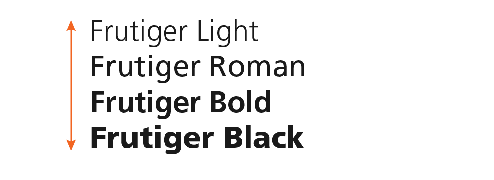
When you need to use the font only for a logo, or for a single title, it's not essential, but to have greater flexibility, I suggest you consider how many weight variations a font has .
2. Does it have true text variants?
In particular, I am referring to italics (or italic), oblique and small caps .
Generally, a quality font, especially if it is to be used for a long text, needs true italics , i.e. a variant of the font that has different glyphs, especially if it is a serif or serif. For example, in this case, the Minion Pro has true italics.
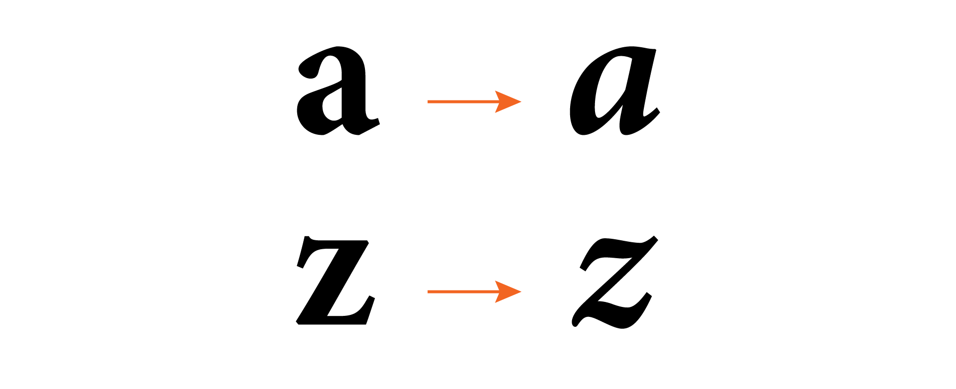
In case it doesn't have an italics, it must have an oblique , as in the case of geometric or neo-grotesque sans-serif fonts such as Futura, Helvetica or Univers. They don't have true italics but still remain quality fonts when used in the right ways.
The important thing is that they don't have an oblique version which is simply a stretched version of the font in the regular version.
Another variant that in my opinion is very important is the small caps . To understand if a font that you already have has REAL small caps, just open a program like Illustrator or InDesign, set a few letters to small capitals and check: is the thickness of the stems the same as that of the lowercase ones? If the answer is yes it is a real small caps, if the answer is no then it is not a real small caps.
3. Does it have good space management?
Managing spaces within a typeface is an art.
Really. True Type Designers (and there are very few in the world) keep their tricks for managing the various kerning pairs as something extremely valuable.
A quality font is one in which, when you use it, you hardly ever have to make any changes in kerning or spacing (unless you have a design need to do so).
4. Do you use Open Type features?
The last aspect, which is very important to me, is that the font has Open Type features .
Open Type is a font file format, developed in the late 90s by Microsoft, which has now become the main format when it comes to font files .
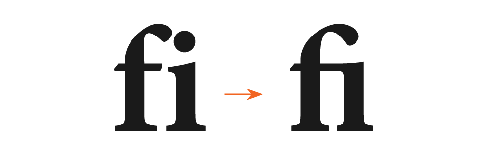
This is because an Open Type font allows you to have many glyphs, many features , such as the use of ligatures, the use of different numbers (such as superscript, subscript), which are all consistent with the rest of the font .
When you subscribe to the blog, we will send you an e-mail when there are new updates on the site so you wouldn't miss them.
About the author
By accepting you will be accessing a service provided by a third-party external to https://www.insightadv.it/


Comments