
Landscape Composition: Masses and Lines
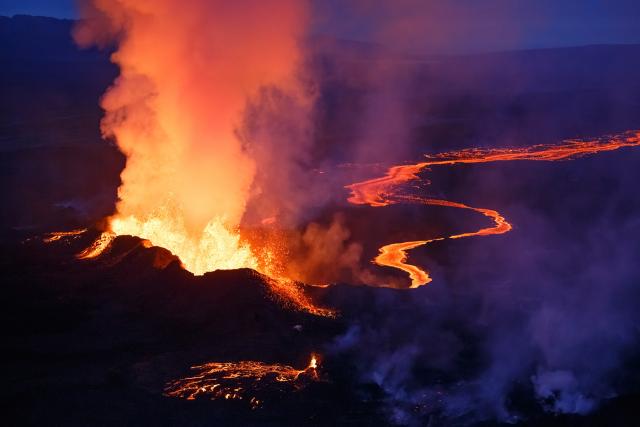
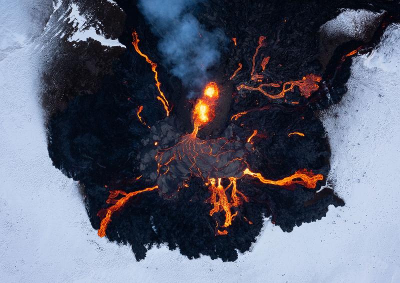 An interesting viewpoint on Fagradalsfjall volcano, Iceland, showing one of the vents in the center, sending lava rivers in various directions. What makes this composition attractive? (DJI Mavic 2 Pro, F7.1, 1/30 sec, panoramic point)
When it comes to landscape photography, composition reigns supreme as the single most important factor that determines the appeal of a shot. It's a complicated subject and people have different views and opinions on it. But over time, I've found that a few key ideas can sum up much of the considerations to keep in mind when trying to compose a landscape shot. In this new series of articles I will try to explain them as clearly as possible using many examples and simple explanations. I will try to apply the "divide and conquer" method in building my arguments about composition, first by explaining how I see compositional elements, and then, in future articles, explaining how to deal with and use these elements to create a good composition.
 A bird's eye view of Ha Long Bay, Vietnam. What are the main elements of the shot? What aspects are balanced and pleasing to the eye? (DJI Mavic II Pro, F8, 1/40 sec, ISO 100, Vertical Panorama)
The image as a set of abstract shapes
To begin, I'd like to introduce a way of thinking of an image as made up of different elements seen as abstract shapes. These shapes can then be used separately and together to create a balanced composition, that is, a whole whose components work well, and in a balanced way, with each other. Shapes aren't just big or small, thick or thin: they have additional properties that change how we treat and place them in the image. This essentially means that I don't see the components as clouds, rocks, mountains and lakes, but as round or elongated, smooth or rough, detailed or lacking in detail. Furthermore, this way of thinking considers color not only as something beautiful that attracts the eye, but also as a property of a compositional component, which can differentiate it from its surroundings.
 Can you distinguish the main components in this image? What properties do they have? How do they differ from their surroundings? What attracts attention? Is there any direction in the composition? (Canon 5D4, Canon 16-35 F2.8 MkIII, 30 sec, F13, ISO 200)
Divide shapes into masses and lines
Okay, but what kind of abstract shapes are there? A useful way to look at this is by dividing shapes into masses and lines. The masses are usually the distinguishable objects in the image, the anchors of the composition, so to speak. They are prominent, distinct and differentiated from their surroundings by having different characteristics (such as colour, shape or texture – a good example is the bushes in the image above, which are different from their surroundings in all these traits), and play a great role in drawing the image in the eyes of the beholder. Lines are what usually connects masses and enhances the interaction between them, but sometimes there's more to it: they can create a better sense of movement, flow and direction in an image, making it more dynamic and interesting.
 Can you see masses and lines in this pair of images?
  The two compositions are somewhat similar. What differentiates them in terms of lines and masses in the composition? Does this selection of lines and masses make a significant difference between the two shots? Is one better composed than the other?
Some images have masses only. Some have lines only. Some have both, and these are usually the more appealing. It's often quite easy to find the masses and lines in an image, especially after some practice and concentration. But in some cases, masses and lines are more difficult to distinguish, which leaves room for discussion. This, however, is not a mathematical theory, but rather a guideline to help develop one's thought process, and experience shows that it works well in improving compositional ability. These terms will prove to be very useful once you start applying them along with actual compositional methods that will allow you to construct your landscape shot.

Some examples
To improve our understanding of compositional elements, the first thing we need to do is look at some examples and determine what masses and lines are in an image. I'm sure you're intuitive, but let's just try this as an exercise. Before scrolling further down, try to look at each composition and find out for yourself what masses and main lines it contains.
 An aerial view of Kawah Ijen Volcano, Indonesia (DJI Mavic II Pro, 1/25 sec, F8, ISO 100)
As you see this picture, it contains three main landmasses: the main crater at the bottom (Kawah Ijen itself), the steepest peak on the left (Gunung Ranti) and then the other 3 volcanoes (Pendil, Raung and Suket). It should also be noted that the mass in the foreground is larger and has the more interesting characteristics: shape, color, level of detail. It could be defined as "the strongest element" of the composition.
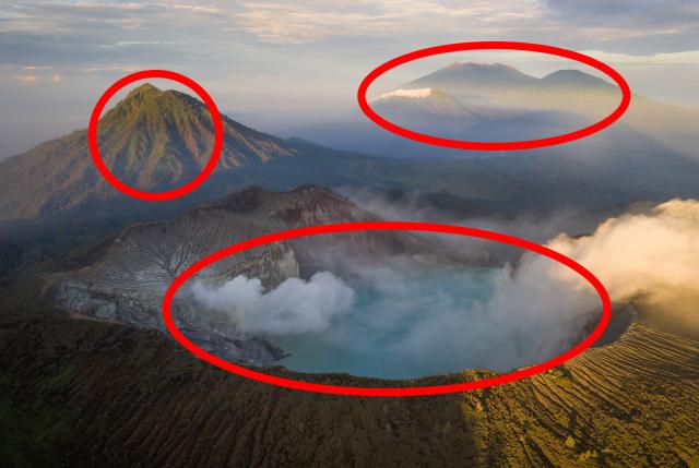
Why do the three furthest volcanoes act as one mass even though there are clearly 3 peaks? This is because they overlap, and furthermore because they are more difficult to distinguish from each other, than the stark difference between the other volcanoes. The viewer's eye does not perceive them as separate elements, but as a locus of information. I will discuss the power of element separation in a future article.
BTW: Can you see why the masses in the image above are sorted the way they are? What prompted the photographer to take this image from this point of view and not from a higher, lower, left or right point (remember this is a drone shot, the photographer was not limited to a specific point of view )? What is it about the arrangement of elements in an image that makes it attractive? This is what you should ask yourself every time you analyze a composition.
And the lines - do you see any? I don't see any real lines here, at least not the ones that matter in the composition. One could mention the faint line of light connecting the crater to the other volcanoes on the right of the image, but I don't think it contributes much to the composition.
Another example:
 A night photo taken in Skogafoss, Iceland (Canon 5D4, Samyang 14mm F2.8, 30 sec, F2.8, ISO 3200)
Here, I'd say there's a real mass - the waterfall - and maybe another, fainter mass in the foreground ice. Note that the waterfall is the more interesting mass, even though the ice takes up more space in the image. In addition to the masses, there are many lines here emanating from the waterfall towards the ice and towards the sky.

Another easy example before we go any further:
 Lava erupting from Holuhraun volcano, Iceland, 2014 (Canon 5D3, Canon 70-300mm F4-5.6, 1/1250 sec, F4, ISO 3200)
You can see a main mass and two lines. The mass is the eruption, the resulting lines are the lava river and the ash cloud. The rest is filler to keep balance and add detail and interest. When sectioning a composition, the filler elements can be seen as existing in another secondary dimension to the main elements.
By now, I hope you're starting to see a pattern: most often, lines break out of the masses, sometimes they connect them, and even create a sense of movement. I can't stress how important that realization is to the composition. We'll talk about it later.
Ok, so far it's been a no-brainer. How about this image:
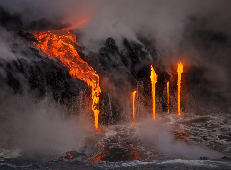 Lava flows into the Pacific Ocean at Kamokuna Ocean Entry, Island of Hawaii. (Canon 5D3, Canon 70-300mm F4-5.6, 1/800 sec, F6.3, ISO 1600)
This one is much more challenging, but, still, I would like you to try to figure out what you think the lines and masses are here. Try to think about which elements, or groups of elements, attract the viewer's attention and have some kind of gravity in the image.
For me, I see two main masses here: the large lava flow in the upper left and the four smaller flows in the lower right. There are lines too: the lava feeding into the larger flow and falling off it, and the reflections on the water. Take a look at the diagram below and see if you agree with me:

It could be argued that the four streams on the right are not a mass but lines. But I would argue that these flows are a counterbalancing subject to the left, and that they are really important and differentiated by their environment as a group. Furthermore, this mass acts as a counterweight to that on the left, creating a more captivating composition without one side being 'heavier' than the other. The bottom lines do the same thing, balancing each other out by going in opposite directions. One by one, the ideas behind good compositions are revealed here - I hope you see them, but even if you don't see them yet, I'll cover them extensively in future articles.
What about this example:
 Beautiful red rock near Moab, Utah. (DJI Mavic II Pro, 1/20 sec, F4, ISO 200)
It seems to me that there are no masses here, only lines. There's nothing that stands out as a distinguishable subject (that could be argued), but there's movement and light and color and really nice texture, and there's a direction to the composition. I think the branching nature of the lines in this image makes up for the lack of discernible subjects.

So far, this has been nothing but a nice exercise in photographic vision. But there is a definite point in viewing compositional elements as masses and lines, or as abstract forms in general. When you adopt this kind of view, it's easier to build a good composition and make sense of the puzzle you face when shooting landscape photos. The next step will explain what we can actually do with these shapes we've discovered, how to use their properties to arrange them in our image, how to balance them, and how to build an ordered composition out of the chaos.
I intend to do just that in future articles, where I'll make use of the definitions introduced here and begin explaining how to use the properties of masses and lines to create good compositions.
When you subscribe to the blog, we will send you an e-mail when there are new updates on the site so you wouldn't miss them.
About the author
By accepting you will be accessing a service provided by a third-party external to https://www.insightadv.it/


Comments