How to create an effective poster?
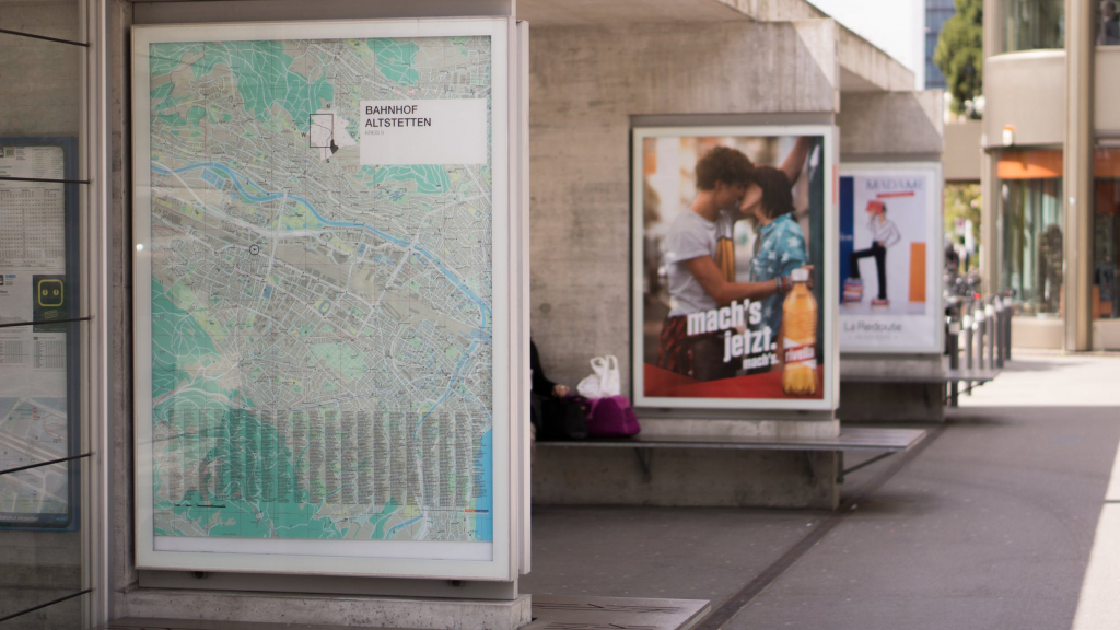
When you work in graphic design, the request to design a poster or create a playbill is certainly one of those that are addressed to you most frequently.
A poster is usually used to communicate an initiative or an event: therefore it must capture attention , convey a series of sensations in line with the message, and be very clear in communicating the information.
As you may have already understood, it is not at all simple. Over the years I have often seen poster projects with excellent ideas and excellent premises, which however could be improved a lot thanks to some tricks.
In this case too, it is a question of applying the basic rules of graphic design, from these and from my experience I have obtained some suggestions for creating a truly effective poster .
Organize information
When you design a poster (or a flyer or a brochure) you always have to insert a lot of information or graphic elements inside the sheet. The first thing to do , then, is organize those items . Before you even enter them!
It can be complicated, especially when you have so much information to enter. My advice? Simple: start by grouping the information to be included in the project into groups of related elements .
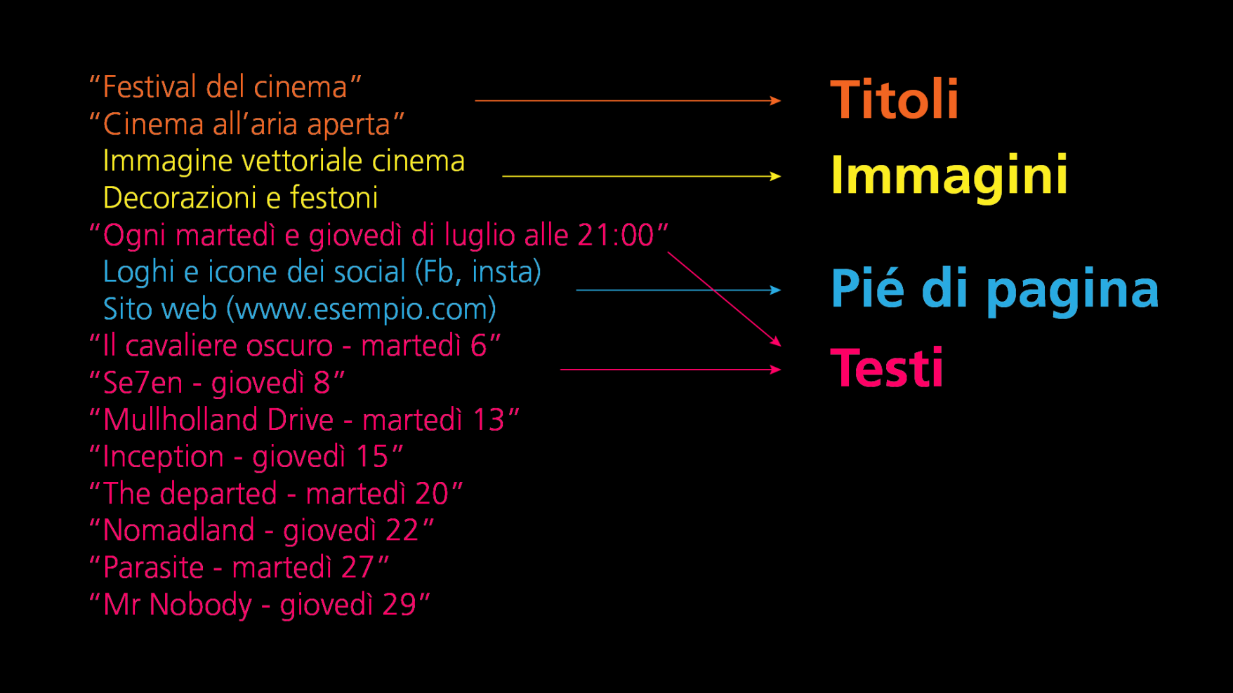
For example: the texts, the main title, the images, the logos, the social icons or the photographs. They are all different groups that will have to play a different role on the page.
This way you can treat each group as its own and it will be easier for you to create an orderly pattern with these chunks of information.
Establish a visual hierarchy
Once the groups of elements have been defined, you will have to organize them , giving each of them a different importance and thus defining a visual hierarchy .
This is one of the basic principles of graphic design . And not using a good visual hierarchy is one of the most typical mistakes for beginners.
The groups you have created will play a different role and have a different importance to the viewer.
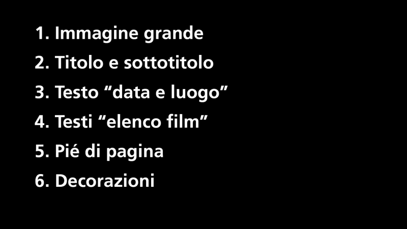
For example, the title will be more important than the text, right? And therefore it will have to have a more prominent role from a visual point of view. A larger size, thicker text weight, or bolder color.
Every visual tool you use must have the result of giving the right value and the right weight to every piece of information that will be transmitted to the observer.
Enter a focal point
Establishing a visual hierarchy is not enough. We also need to make sure that the eye immediately goes to what will be the most important information or that attracts the most attention. Basically, you need to create a focal point .
The focal point is important in all your graphic projects, but especially in a poster, because an effective poster must capture attention and convey a message, information, in a very short time.
So the first thing to do when you start creating a poster is to set your design around a focal element . It can be a graphic element, a photo, or a text with a strong visual impact.
In the case of our poster , the focal point will be a vector image (downloaded under a paid license fromAdobe Stock ), this for example:
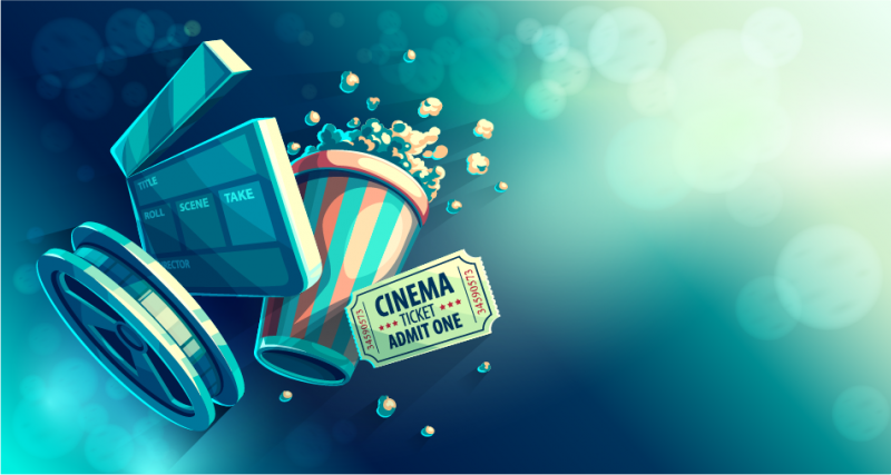
This is the initial image that I then decided to customize further. Since the theme of the poster is "outdoor cinema" I had the idea of inserting it on a dark blue background, to remember the night, and transform those popcorns into a starry sky , like this:

Enter the right number of items
Whether the poster is used to promote an event, an evening or a commercial offer, the problem is always the same: the temptation to put too many things on it . Too many writings, information, graphic elements.
The result? You risk losing the focal point completely.
Once the focal point has been placed and valued correctly , add only the necessary textual information, without superfluous elements that would only serve to distract.
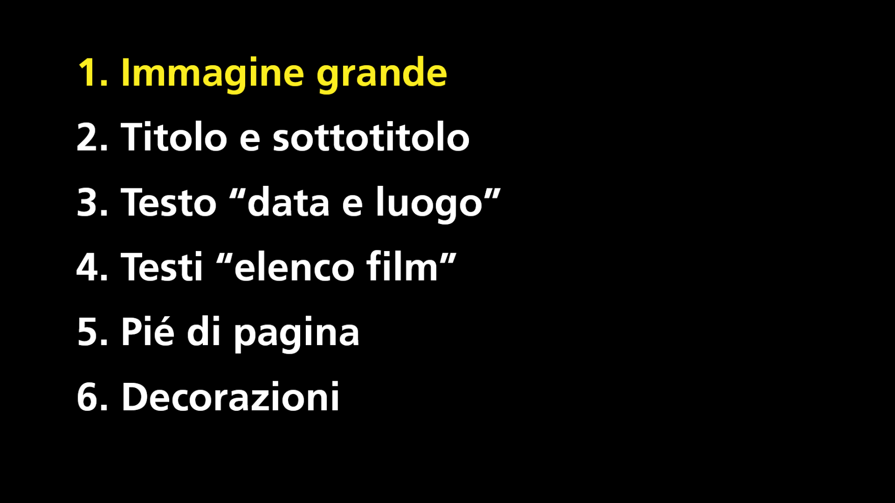
In our case, we add the title and subtitles , always following our hierarchical scale:

At this point, however, the space occupied by the image and the background covers every possible empty space and we no longer have areas in which to insert texts and other important information.
So let's go to synthesize the image, removing elements that are superfluous and redundant :
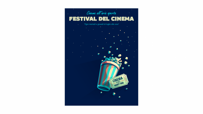
Now we have the space to enter the other texts!
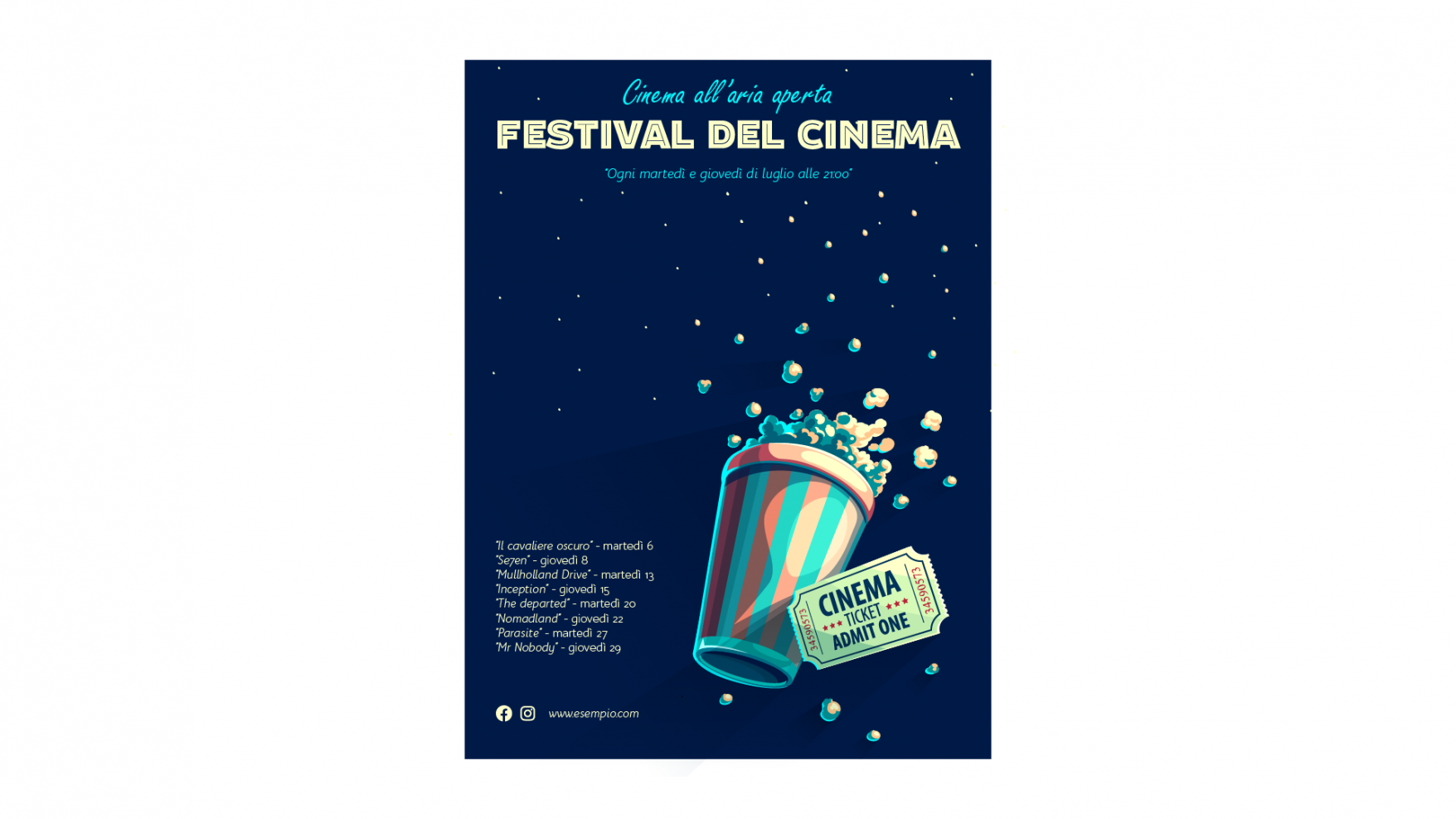
Small note: also remember that inserting too few elements , however, can cause the opposite effect: confusion and misunderstanding .
In the “ Less is more ” graphic, it doesn't necessarily mean removing everything. It means removing only the superfluous, the useless. As done in this case, where the meaning and the message have been maintained.
Align elements using the elements themselves
In graphic design, as in many other professions or disciplines, the rules must be learned well , and then broken .
Grids are always a good starting point for your projects.
In this case, for example, the grids define the margins of the layout:

But sometimes the alignment that comes from grids isn't the only one that can help you.
If, for example, you choose to use an image or a graphic element as a focal point , you can align other elements, such as textual ones, to it . But each graphic element can also be aligned with others, to create visual connection and dynamic order.
In this case the point where the paragraph is positioned is chosen based both on the positioning of an image element (pink line) and on the margin and then on the grid (orange line):
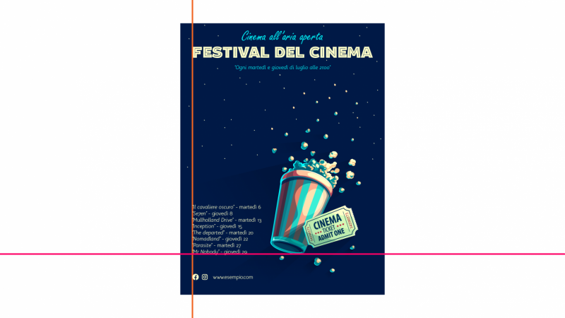
This will give you a visually uncluttered result that maintains a solid hierarchy and helps emphasize the focal point.
Exploit contrasts
To attract the attention of the viewer without having to resort to too many elements, you need to give your project the right dynamism .
A smart and effective way to do this is to take advantage of contrasts . The classic example is the use of colors that contrast with each other, as in the case of our poster.

Other examples can be the approaches of different types of alignment. Or the placement of a visual element, such as a photo, with a cut or a characterizing element in total dissonance with the rest of the poster. Or still experimenting with overlays, or with color contrasts.
They are all valid methods to give the right dynamism to your project without creating confusion in the distribution of elements or losing the focal point.
Extremize
When you create a poster, always think that it is something that we often look at out of the corner of our eye, to which we dedicate very few fractions of a second, perhaps because we are driving, we are on the bus, or in any case we happen to see it while we are engaged in all 'other activities.
To be relevant then our project must be , in some way, extreme .
For example, the dimensional relationship between the title and the texts and/or between the focal point and other elements can be extremes.
As? Enlarging it, simply.
In fact, in the poster we've worked on so far, I deliberately made a mistake just to explain this point well to you.
Often beginners in graphics tend to place the elements on the page all more or less the same size. Because, perhaps, they are afraid to dare too much .
Nothing more wrong. We have to go to extremes . Let's try it a bit :
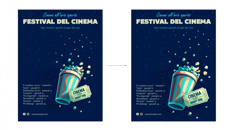
Much better, right?
Decidedly.
Well, know that it's absolutely not enough .
When I say extreme, I really mean extreme .
As:
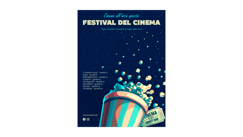
Do you realize now what I mean? The change is radical. Thus, the poster is decidedly more impactful, more exciting, more… cool!
This is because we simply moved and cut an image. Remember this when you make your next layouts, please.
Stay consistent
Just as I have already suggested for the quantity of elements to include in your project, it is also important to remember the function and specificity of a poster as regards style choices.
In fact, it is not a product created to provide insights or variety of ideas. It must communicate a concept, information, a suggestion.
The more your project remains consistent with the identity of the brand , with the taste of the target you are designing it for, with the idea you want to communicate, the more effective it will be.
An example is the use of colors and images in line with the "tone of voice" of the brand.
When you subscribe to the blog, we will send you an e-mail when there are new updates on the site so you wouldn't miss them.
By accepting you will be accessing a service provided by a third-party external to https://www.insightadv.it/














































Comments