
How to proofread: some tips and how to do it in practice
When we study at school or university we are used to reading manuals of many pages in the shortest possible time, obtaining and memorizing the essential information and forgetting the others.
When, on the other hand, we go hunting for the error, we need to train ourselves in a reading that will be much slower and more tiring, especially at the beginning. To help you, I recommend initially reading on paper by holding a ruler or a white sheet folded in half under the line, in order to isolate it from the text that follows and help you concentrate. You can switch to monitor reading as soon as you become more familiar with it.
Also, until you're sure that your brain has learned to hunt for the typo on its own (it happens after years of work, when you hit double space on the back of the yogurt package at seven in the morning on the first try) read by ringing out each word in the head , perhaps even moving the lips, as we did when we were children.
If you feel like you've lost the general meaning of the sentence, read it again or have it read in synthetic voice.
Maintaining attention for this kind of reading is heavy: approach it as if you were deciphering an employment contract, and take a short break as soon as you notice that you lose the thread.
For more delicate parts of text, such as titles, you can adopt the old trick of reading the sentence backwards , word for word: in this way, you will not risk being misled by well-known phrases and you will be sure that you have read everything .
Proofreader tools
Before going into the correction of our draft, let's see what the tools are and how technology has come to our aid. From the time of Gutenberg to today times have changed and the proofreader no longer lives curled up in small enclosures located in the darkest and most disturbed parts of the printing houses, but works at a desk, often still with pen and paper or in front of the screen of a computer.
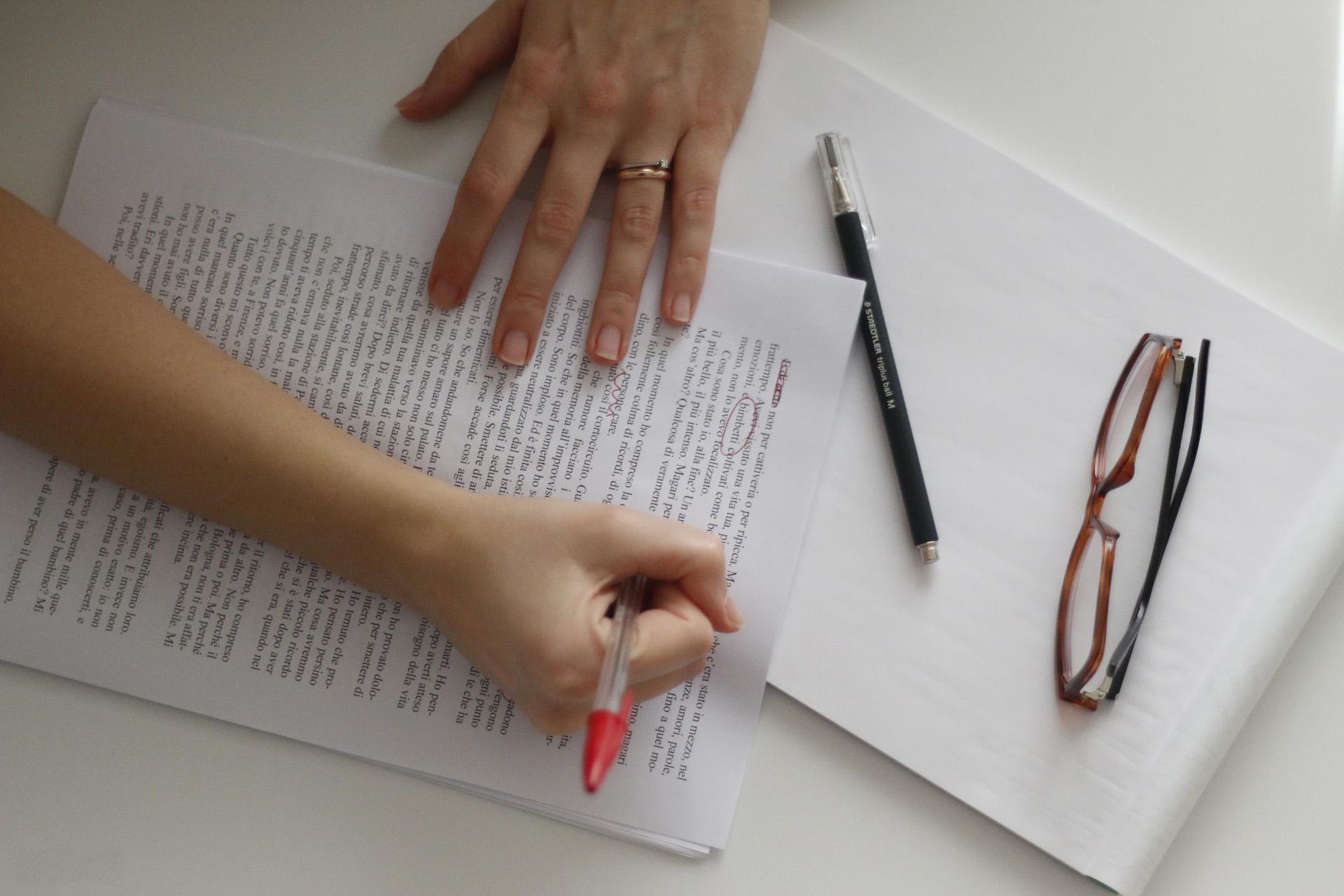
In carrying out his work the proofreader uses simple tools:
- as we have seen, the ruler that serves to focus attention word by word on what is being read and corrected;
- The inevitable red pen to highlight errors and corrections;
- The original text to consult in case of doubts;
- The magnifying glass if the text is written small: to correct periods, commas and other punctuation marks it is better to see clearly.
If these are the classic tools of the proofreader, more or less the same that could be used in Gutenberg's time, today the proofreader often works on the computer using specific correction programs . In addition to the now classic word processing programs such as Microsoft Word, LibreOffice or OpenOffice, there are other services on the net that can be used by proofreaders in carrying out their work:
- LanguageTool.org;
- Spellchecker.net;
- Translated. com
Don't look for errors all at once
It is very difficult to see all the problems in a text in one reading from cover to cover.
There are not only the "errors", there is an infinite number of elements that need to be checked… The trick is to "stratify" the attention : for example, read the entire draft with care, but at the end go back to the front page and read all the headlines, and only those. Then check all the lists, and only those: is the number sequence correct? Is there always a semicolon at the end of the sentence, or a period, or nothing?
Do the same with the captions (and related images), with the notes, with the headers, with the page numbers, with the indents of the text, with the quotations, in short, with all the elements that must be consistent with each other. Because an absolutely fundamental rule in publishing is uniformity.
At the end of the work, don't forget to check that the table of contents and the inside (titles, mastheads) match perfectly.
If you have the file in electronic format, you can more easily identify all the italics or bolds out of place, the deuphonics, double spaces, punctuation preceded by a space, accents made with the apostrophe, superscripts instead of quotation marks…
A useful subterfuge not only for beginners is to use Word's spell checker, with common sense and attention, at the end of the reading. Not so much for typos you didn't find, but for those you may have inadvertently entered by typing in the corrections.
If you only have the file in Pdf, no problem: with Acrobat Pro you can convert it to .doc, otherwise (even if the result is not perfect) copy and paste it into a Word file and check it in the same way, naturally considering that there will be some inaccuracies physiological due to the incompatibility of certain aspects of the two programs. But if it helps to do better, why not?
How corrections are noted
Whether you use video writing programs or still use the classic methods such as a red pen and ruler, the proofreader writes the correction to the sides of the text (in the margins if he writes in pen) adding a comment if he works on the computer .
To make the correction more effective, link the comment to the incorrect sentence using an arrow or an underline. If you find typos, or typographical errors, you draw a line over the incorrect words and write the correction to the side (or in the comments). When you find yourself in front of a sequence of incorrect words, you restore the order within the sentence by writing on each word the number that indicates the correct sequence.
To improve the reading and interpretation of the corrections, there are specific symbols based on the UNI standards. You can download this pdf where you can recognize them and become familiar with their use.
On paper they are used like this: within the text, mark the word, letter, sentence or punctuation mark you want to correct with the appropriate symbol; show the same symbol in the margin of the text (at the same height and on the side closest to the element to be corrected) and write the correction you want to make next to it.
If, for example, in a line of text you crossed out the word "dog" with two dashes, you will write the two dashes followed by the correct word in the margin, for example "meat". Or you will mark the “n” of “dog” with a barline surmounted by a dot, and in the margin you will report an identical barline and the correction “rn”.
The important thing is that you understand what you mean .
What kind of proofreading?
Ask, if they haven't explained it to you, what level of detail is expected of you : just typos and errors or even a general improvement in style?
Often the second of the two things is not required (because it has already been done, because the author is reliable or very touchy, because a more expert colleague will take care of it, because the publisher is improvised and has never thought about it...) .
It is useful to decide on a different "code" for two levels of correction : for example, with the red pen (or the comments on PDFs with a red background) typos, unequivocal errors and graphic inaccuracies; in pencil (or with a green background) the suggestions (preferable synonyms, sentences reworked for stylistic reasons, advice not explicitly requested but which seem important to you...) and your annotations.
editorial rules
But when should I use bold? If I want to quote a text, do I have to insert a dash or quotation marks? If I write a word in a foreign language is it better to use italics?
If these questions don't seem trivial to you or refer to details of little importance, you have the right mindset of the proofreader . The answers to the above questions can be found in the so-called drafting rules , i.e. that set of conventions that regulate the formatting of a written text.
The difficulty with editorial standards is that they are not absolute and each publishing house has its own, which must be followed painstakingly for all published books.
To get out of this infinite set of rules and regulations, the publishing houses and editorial offices of the newspapers throw you a lifesaver, or rather a guide that contains all the editorial rules and criteria.
The fundamental criterion when it comes to formatting a text is uniformity : since each publishing house chooses its own, it is important that all published texts follow the same formatting criteria and that there is formal coherence within the text.
Before seeing in detail what the main drafting standards are, let's see how a text would be if they were not used:
Francesco was sitting on a bench in the park reading a book and listening to music on his I-Pod . After half an hour his friend Filippo joins him accompanied by his dog.
"Hello Francis, how are you?"
«Hi Filippo, thank you very much, I found this I-Pod in a drawer with some music I hadn't heard in years: I'm taking a dive into the past».
See how in the first line we used high quotation marks to signal direct speech, while in the answer we used low quotation marks?
There is also another formatting error, can you locate it?
This short text that we have written does not follow coherent editorial rules and, therefore, could not be published.
Proofreader general rules
We have seen that every publishing house provides its proofreaders with the editorial rules to follow ; with experience you will also learn that there are standard rules , homogeneous for almost all publishing houses. We will see them together in this paragraph.
- Punctuation : punctuation marks must always be attached to the preceding word and detached from the following one;
- Double spaces : they are easy to spot if you use a word processing program, but if you work with pen and paper, you need a well-trained eye.
- Accent : the accent is used on some monosyllables to differentiate them (è ≠ from e, sé ≠ from se). Pay attention to words that require a grave accent and those that require an acute one;
- Uppercase and lowercase : the general rule is that capital letters should never be used when writing a text unless it is acronyms. Geographical names and historical or political entities are capitalized: cities, states, continents, regions; the Ottoman Empire, the United States of America.
- Italics and bold : italics should be used for the titles of volumes or articles, for foreign words that have not yet entered the current use of the Italian language, for Latin quotations. Bold should be avoided unless writing for the web;
- Inverted commas : low inverted commas [« »] are used to indicate short quotations, while inverted commas [“ ” ] are used to highlight single words;
- Quotations : when they are longer than three lines, quotation marks are not used but the quotation is inserted using a smaller font and indenting the text both on the right and on the left; in other cases, they are entered in quotation marks.
When you subscribe to the blog, we will send you an e-mail when there are new updates on the site so you wouldn't miss them.
About the author
By accepting you will be accessing a service provided by a third-party external to https://www.insightadv.it/


Comments